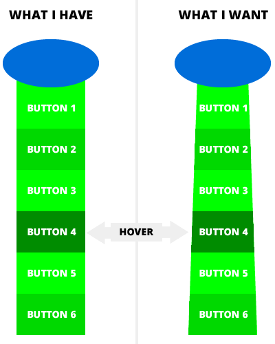
基本上,下图总结了我的问题。
有什么优雅的解决方案可以让它工作吗?我尝试过使用 rotate、skew 和 perspective,但对我不起作用。
注意:背景需要透明。
我的代码给你。 :)
* { box-sizing: border-box; }
body { font: normal 16px sans-serif; }

.spaceship {
  height: 430px;
  position: relative;
  width: 140px;
}

.spaceship::before {
  background: #006dd9;
  border-radius: 100%;
  content: '';
  height: 70px;
  position: absolute;
  width: 140px;
  z-index: 1;
}

.abduction {
  background: #0f0;
  height: 370px;
  left: 20px;
  padding-top: 10px;
  position: absolute;
  top: 60px;
  width: 100px;
}

.abduction a {
  color: #fff;
  display: block;
  height: 60px;
  padding-top: 25px;
  text-align: center;
  text-decoration: none;
  text-transform: uppercase;
  transition: background 500ms;
}

.abduction a:nth-child(even) { background: #00d900; }
.abduction a:hover { background: #008c00; }
<div class="spaceship">
<div class="abduction">
<a href="#">Button 1</a>
<a href="#">Button 2</a>
<a href="#">Button 3</a>
<a href="#">Button 4</a>
<a href="#">Button 5</a>
<a href="#">Button 6</a>
</div>
</div>最佳答案
以下是我更改您的 CSS 以使其看起来像您的图片并实现正确的悬停效果:
* { box-sizing: border-box; }
body { font: normal 16px sans-serif; }
.spaceship {
height: 430px;
position: relative;
width: 140px;
}
.spaceship::before {
background: #006dd9;
border-radius: 100%;
content: '';
height: 70px;
position: absolute;
width: 140px;
z-index: 1;
}
.abduction {
height: 370px;
left: 20px;
padding-top: 5px;
position: absolute;
top: 60px;
width: 100px;
}
.abduction a {
color: #fff;
display: block;
height: 65px;
margin: 0 auto;
padding: 0;
border-bottom: 65px solid #0f0;
border-left: 3px solid transparent;
border-right: 3px solid transparent;
line-height: 5;
font-size: 12px;
text-align: center;
text-decoration: none;
text-transform: uppercase;
transition: border-bottom-color 500ms;
}
.abduction a:nth-child(5){
width: 94px;
}
.abduction a:nth-child(4){
width: 88px;
}
.abduction a:nth-child(3){
width: 82px;
}
.abduction a:nth-child(2){
width: 76px;
}
.abduction a:nth-child(1){
width: 70px;
}
.abduction a:nth-child(even) { border-bottom-color: #00d900; }
.abduction a:hover { border-bottom-color: #008c00; }
<div class="spaceship">
  <div class="abduction">
    <a href="#">Button 1</a>
    <a href="#">Button 2</a>
    <a href="#">Button 3</a>
    <a href="#">Button 4</a>
    <a href="#">Button 5</a>
    <a href="#">Button 6</a>
  </div>
</div>所以基本上要创建一个 65px 高的带边框梯形(颜色为 #0f0),您需要这样做:
border-bottom: 65px solid #0f0;
border-left: 3px solid transparent;
border-right: 3px solid transparent;
最后一个元素的宽度是 100px。因此,由于左边框宽度 + 右边框宽度 = 6px 和 100px - 6px = 94px,倒数第二个元素的宽度为 94px 以匹配最后一个元素的顶部。您从先前的元素宽度中减去侧边框总和以获得当前元素宽度。
此外,transition 属性需要更改为 border-bottom-color 而不是 background,因为 border-bottom-color 是用来设置梯形颜色的。
关于css - 带有 CSS 的宇宙飞船菜单,我们在Stack Overflow上找到一个类似的问题: https://stackoverflow.com/questions/29114728/