我想创建一个 2 列流式布局,左侧导航栏的高度应为 100%,标题的宽度应为 100%,内容部分的高度和宽度应为也为 100%,并且在 10 或 20 像素的所有边上应该有边距,在标题、导航和内容框之间也应该有边距。这是我的 fiddle :
https://jsfiddle.net/d2Lnq6sd/1/
header {
  position: relative;
  height: 75px;
  width: 100%;
  background-color: red;
  border: 1px solid black;
}

nav {
  position: relative;
  top: 20px;
  left: 0px;
  height: 100%;
  width: 200px;
  padding: 10px;
  background-color: blue;
  border: 1px solid black;
}

section {
  position: absolute;
  top: 110px;
  left: 240px;
  width: 100%;
  background-color: green;
  border: 1px solid black;
}
现在您可以看到导航栏的高度不是 100%,内容部分太宽。我的最终结果应该是这样的:
http://imageshack.com/a/img921/9425/UYp8Ah.png
尝试在谷歌上寻找关于这个问题的帮助,但我仍然不知道我应该使用什么,相对或绝对位置以及哪个用于哪个属性。有什么指点吗?
最佳答案
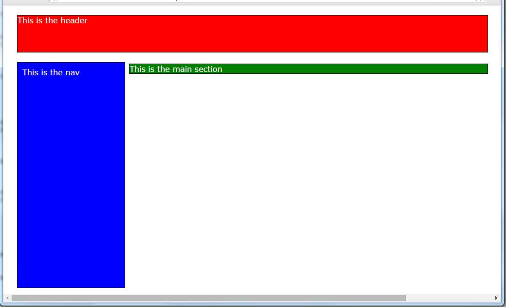
一切顺利:http://codepen.io/8odoros/pen/vKxVYv?editors=1100
- 导航栏是 100% 的高度
- 内容部分也不 宽
html, body {
    height:calc(100% - 60px);
}
body {
  font-family: verdana;
  color: #fff;
}

.container {
  position: relative;
  margin: 10px;
  padding: 10px;
  height:100%;
  box-sizing:border-box;
}

header {
  float:left;
  height: 75px;
  width: 100%;
  background-color: red;
  border: 1px solid black;
  box-sizing:border-box;
}
nav {
  float:left;
  margin-top:20px;
  height: 100%;
  width: 200px;
  padding: 10px;
  background-color: blue;
  border: 1px solid black;
  box-sizing:border-box;
}

section {
  float:right;
  margin-top:20px;
  height:100%;
  padding: 10px;
  width:calc(100% - 220px);
  background-color: green;
  border: 1px solid black;
  box-sizing:border-box;
}
<div class="container">
<header>
This is the header
</header>
<nav>
This is the nav
</nav>
<section>
This is the main section
</section>
</div>关于html - CSS - 2列布局,我们在Stack Overflow上找到一个类似的问题: https://stackoverflow.com/questions/38092212/