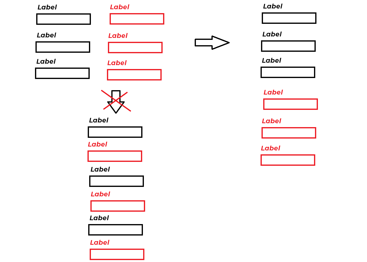
目标是拥有一个包含两列的表单。在计算机显示器上查看时,会出现两列,但在移动设备上,这些列会堆叠在一起。我正在使用 Bootstrap 。我预计我将使用内联和内联 block 的某种组合,但可以使用一些指导。
示例表格
<!doctype html>
<html lang="en">
  <head>
    <!-- Required meta tags -->
    <meta charset="utf-8">
    <meta name="viewport" content="width=device-width, initial-scale=1, shrink-to-fit=no">

    <!-- Bootstrap CSS -->
    <link rel="stylesheet" href="https://stackpath.bootstrapcdn.com/bootstrap/4.3.1/css/bootstrap.min.css" integrity="sha384-ggOyR0iXCbMQv3Xipma34MD+dH/1fQ784/j6cY/iJTQUOhcWr7x9JvoRxT2MZw1T" crossorigin="anonymous">

    <title>Test Form</title>
  </head>
  <style>

    /* ??? */

  </style>
  <body>
  <form action="test.php" method="post" enctype="multipart/form-data">
    <div class="row">
        <div class="form-group col-md-6">
            <h5>Label 1</h5>
            <input type="text" name="value1" class="form-control">
        </div>

        <div class="form-group col-md-6">
            <h5>Label 2</h5>
            <input type="text" name="value2" class="form-control">
        </div>
    </div>
    <div class="row">
        <div class="form-group col-md-6">
            <h5>Label 3</h5>
            <input type="text" name="value3" class="form-control">
        </div>

        <div class="form-group col-md-6">
            <h5>Label 4</h5>
            <input type="text" name="value4" class="form-control">
        </div>
    </div>
    <div class="row">
        <div class="form-group col-md-6">
            <h5>Label 5</h5>
            <input type="text" name="value5" class="form-control">
        </div>

        <div class="form-group col-md-6">
            <h5>Label 6</h5>
            <input type="text" name="value6" class="form-control">
        </div>
    </div>

    <input type="submit" value="Submit" class="btn btn-primary btn-lg">
    </form>

    <!-- Optional JavaScript -->
    <!-- jQuery first, then Popper.js, then Bootstrap JS -->
    <script src="https://code.jquery.com/jquery-3.3.1.slim.min.js" integrity="sha384-q8i/X+965DzO0rT7abK41JStQIAqVgRVzpbzo5smXKp4YfRvH+8abtTE1Pi6jizo" crossorigin="anonymous"></script>
    <script src="https://cdnjs.cloudflare.com/ajax/libs/popper.js/1.14.7/umd/popper.min.js" integrity="sha384-UO2eT0CpHqdSJQ6hJty5KVphtPhzWj9WO1clHTMGa3JDZwrnQq4sF86dIHNDz0W1" crossorigin="anonymous"></script>
    <script src="https://stackpath.bootstrapcdn.com/bootstrap/4.3.1/js/bootstrap.min.js" integrity="sha384-JjSmVgyd0p3pXB1rRibZUAYoIIy6OrQ6VrjIEaFf/nJGzIxFDsf4x0xIM+B07jRM" crossorigin="anonymous"></script>
  </body>
</html>
最佳答案
试试这个片段
body{margin: 10px}
.m2{background: yellow}
.m1{background: cyan}
<link href="https://stackpath.bootstrapcdn.com/bootstrap/4.3.1/css/bootstrap.min.css" rel="stylesheet"/>
<form action="test.php" method="post" enctype="multipart/form-data">
<div class="row">
<div class="col-md-6 m1">
<div class="row">
<div class="form-group col-md-12">
<h5>Label 1</h5>
<input type="text" name="value1" class="form-control">
</div>
<div class="form-group col-md-12">
<h5>Label 2</h5>
<input type="text" name="value2" class="form-control">
</div>
<div class="form-group col-md-12">
<h5>Label 3</h5>
<input type="text" name="value3" class="form-control">
</div>
</div>
</div>
<div class="col-md-6 m2">
<div class="row">
<div class="form-group col-md-12">
<h5>Label 4</h5>
<input type="text" name="value4" class="form-control">
</div>
<div class="form-group col-md-12">
<h5>Label 5</h5>
<input type="text" name="value5" class="form-control">
</div>
<div class="form-group col-md-12">
<h5>Label 6</h5>
<input type="text" name="value6" class="form-control">
</div>
</div>
</div>
</div>
<input type="submit" value="Submit" class="btn btn-primary btn-lg">
</form>关于html - 在表格中堆叠两列与在移动设备上合并,我们在Stack Overflow上找到一个类似的问题: https://stackoverflow.com/questions/57300149/