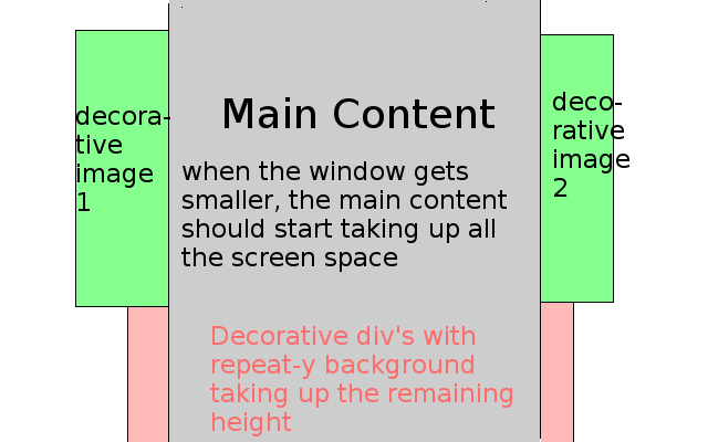
我想像这样在两边都包含我的网站(这显示了用户浏览器窗口):
 (请原谅 gimp 技能...)
我希望主要内容随着窗口尺寸的减小而变小。
无论如何,到目前为止我已经tried this (JSFiddle) :
HTML:
<div id="everything" class="container">
  <div id="left" class="container side-image-left"></div>
  <div class="container  main ">
    ... header logo etc ...
    <div class="container content">
      ...
    </div>
    ... footer etc ...
  </div>
  <div id="right" class="container side-image-right"></div>
</div>
CSS:
#everything {
    /*
    this was my temporary try for the red divs in my image,
    just a static, nonadjusting background with width 1366px.

    background-image: url('../images/bg_everything.png');
    background-repeat:repeat-y;*/
    padding: 0;
    overflow: hidden;
    position: relative;
    max-width: 1366px;
}

.side-image-left, .side-image-right {
    position: absolute;
    top: 100px;
    width: 125px;
    height: 100px;
}
.side-image-right {
    right: 0;
}
.main {
    position: relative;
    max-width: 1116px;
    padding: 0;
    z-index: 100;
}
问题:
侧面的 div 贴在内容上,但一旦浏览器窗口太小,它们就会贴在浏览器窗口上
我在“主”.container 中有第二个“content”.container,它在调整大小时会产生小的“跳跃”。主容器背景永远不应该显示,但在这些“跳跃”期间,两边都有一些空白空间。最好在 jsfiddle 上查看.
那么,我怎样才能得到如图所示的所需行为呢?
最佳答案
我终于通过这样做解决了这个问题:
HTML
<div id="bgfix">
    <div id="main">
        <div id="leftbg"></div>
        <div id="rightbg"></div>
    </div>
</div>
CSS
html, body {
    height: 100%;
}

#bgfix {
    min-width: /* main width (1116px in this case) */;
    height: 100%;

    overflow-x: hidden;

    background-image: /* main background url */;
    background-position: center;
    background-repeat: repeat-y;
}

#main {
    width: 1116px;

    position: relative;
    margin: 0 auto;
}

#leftbg {
    position: absolute;
    width: /* image width */;
    background-image: /* image url */;

    left: /* -(image width) */;
}

#rightbg {
    /* same as leftbg */
    right: /* -(image width) */; /* except use right instead of left */
}
关于html - 在我的网页左右两侧放置装饰图片,我们在Stack Overflow上找到一个类似的问题: https://stackoverflow.com/questions/18704776/