我想要双列布局用于较宽的屏幕,单列布局用于较窄的屏幕。
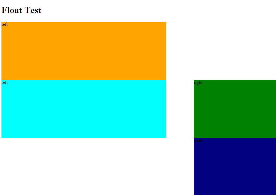
在双列布局中,我希望“左”和“右”项堆叠在彼此下方。
在单列布局中,我希望元素遵循它们在 html 中的写入顺序。
为了演示,这两个示例在双列版本中应该看起来相同:
HTML 1
<div class="left">left one</div>
<div class="left">left two</div>
<div class="left">left three</div>
<div class="right">right one</div>
<div class="right">right two</div>
<div class="right">right three</div>
HTML 2
<div class="left">left one</div>
<div class="left">left two</div>
<div class="right">right one</div>
<div class="left">left three</div>
<div class="right">right two</div>
<div class="right">right three</div>
CSS
我试过这样的 CSS,但它不起作用,因为“右” float 元素不会在 2 个或更多“左” float 元素之后到达页面顶部。
<style>

.left {float:left;}
.right {float:right;}

@media (max-width:991px){
    .left,
    .right  {
        width:100%;
    }
}
@media (min-width:992px){
    .left {
        width:60%;
        float:left;
    }
    .right {
        width:30%;
        float:right;
    }
}
</style>
最佳答案
我认为这些规则可以完成工作:
@media (min-width: 992px) {
    .left {
        width: 60%;
    }
    .right {
        width: 30%;
        float: none;
        display: inline-block;
        margin-left: 10%;
    }
}
要使右侧的元素正确 float ,您可以将它们设置为 float: none 用于宽尺寸,marging-left: 10% 将处理列之间适当的 10% 间隙.
演示:http://jsfiddle.net/3dkmt84n/
注意:为了演示目的,在演示中 min-width 被缩减为 400px。
关于html - 控制单列/双列布局中的 div 顺序?有可能吗?,我们在Stack Overflow上找到一个类似的问题: https://stackoverflow.com/questions/26950371/