我正在使用预先编写的响应式菜单。
http://responsivemobilemenu.com/en/
使用起来相当容易,但我无法将菜单设置为 100% 宽。我将它固定在页面顶部以随用户滚动。菜单代码位于 http://jsfiddle.net/uvd1hfrx/ 中。
在桌面版中,它不会达到 100% 宽度,因此您必须在 fiddle 上调整结果部分的大小。
我已经尝试将 width: 100% 添加到 CSS 的各个部分,但没有调整它的大小。
谁能帮我弄清楚如何让这个菜单与用户屏幕一样宽?
完整代码:
HTML:
 <div class="rmm" data-menu-style = "graphite">
            <ul>
                <li><a href='#home'>Home</a></li>
                <li><a href='#about-me'>About me</a></li>
                <li><a href='#gallery'>Gallery</a></li>
                <li><a href='#blog'>Blog</a></li>
                <li><a href='#links'>Links</a></li>
                <li><a href='#sitemap'>Sitemap</a></li>
            </ul>
        </div
CSS:
/*

Responsive Mobile Menu v1.0
Plugin URI: responsivemobilemenu.com

Author: Sergio Vitov
Author URI: http://xmacros.com

License: CC BY 3.0 http://creativecommons.org/licenses/by/3.0/

*/

.rmm {
    display:block;
    position:relative;
    width:100%!important;
    padding:0px;
    margin:0 auto !important;
    text-align: center;
    line-height:19px !important;
    position: fixed;
    top: 0;
}
.rmm * {
    -webkit-tap-highlight-color:transparent !important;
    font-family:Arial;
}
.rmm a {
    color:#ebebeb;
    text-decoration:none;
}
.rmm .rmm-main-list, .rmm .rmm-main-list li {
    margin:0px;
    padding:0px;
}
.rmm ul {
    display:block;
    width: 100% !important;
    margin:0 auto !important;
    overflow:hidden;
    list-style:none;
}
.rmm .rmm-main-list li {
    display:inline;
    padding:padding:0px;
    margin:0px !important;
}
.rmm-toggled {
    display:none;
    width:100%;
    position:relative;
    overflow:hidden;
    margin:0 auto !important;
}
.rmm-button:hover {
    cursor:pointer;
}
.rmm .rmm-toggled ul {
    display:none;
    margin:0px !important;
    padding:0px !important;
}
.rmm .rmm-toggled ul li {
    display:block;
    margin:0 auto !important;
}


/* GRAPHITE STYLE */
.rmm.graphite, .rmm.graphite {
        width: 100%;
}
.rmm.graphite .rmm-main-list li a {
    display:inline-block;
    padding:8px 30px 8px 30px;
    margin:0px -3px 0px -3px;
    font-size:15px;
    text-shadow:1px 1px 1px #333333;
    background-color:#444444;
}
.rmm.graphite .rmm-main-list li a:hover {
    background-image:url('');
}
.rmm.graphite .rmm-toggled {
    width:100%;
    background-color:#555555;
    min-height:36px;
}
.rmm.graphite .rmm-toggled-controls {
    display:block;
    height:36px;
    color:white;
    text-align:left;
    position:relative;
}
.rmm.graphite .rmm-toggled-title {
    position:relative;
    top:9px;
    left:15px;
    font-size:16px;
    color:white;
    text-shadow:1px 1px 1px black;
}
.rmm.graphite .rmm-button {
    display:block;
    position:absolute;
    right:15px;
    top:8px;
}

.rmm.graphite .rmm-button span {
    display:block;
    margin-top:4px;
    height:2px;
    background:white;
    width:24px;
}
.rmm.graphite .rmm-toggled ul li a {
    display:block;
    width:100%;
    background-color:#555555;
    text-align:center;
    padding:10px 0px 10px 0px;
    border-bottom:1px solid #333333;
    border-top:1px solid #777777;
    text-shadow:1px 1px 1px #333333;
}
.rmm.graphite .rmm-toggled ul li a:active {
    background-color:#444444;
    border-bottom:1px solid #444444;
    border-top:1px solid #444444;
}
JQuery:
/*
Responsive Mobile Menu v1.0
Plugin URI: responsivemobilemenu.com
Author: Sergio Vitov
Author URI: http://xmacros.com
License: CC BY 3.0 http://creativecommons.org/licenses/by/3.0/
*/
function responsiveMobileMenu() {
$('.rmm').each(function() {
$(this).children('ul').addClass('rmm-main-list'); // mark main menu list
var $style = $(this).attr('data-menu-style'); // get menu style
if ( typeof $style == 'undefined' || $style == false )
{
$(this).addClass('graphite'); // set graphite style if style is not defined
}
else {
$(this).addClass($style);
}
/* width of menu list (non-toggled) */
var $width = 0;
$(this).find('ul li').each(function() {
$width += $(this).outerWidth();
});
// if modern browser
if ($.support.leadingWhitespace) {
$(this).css('max-width' , $width*1.05+'px');
}
//
else {
$(this).css('width' , $width*1.05+'px');
}
});
}
function getMobileMenu() {
/* build toggled dropdown menu list */
$('.rmm').each(function() {
var menutitle = $(this).attr("data-menu-title");
if ( menutitle == "" ) {
menutitle = "Menu";
}
else if ( menutitle == undefined ) {
menutitle = "Menu";
}
var $menulist = $(this).children('.rmm-main-list').html();
var $menucontrols ="<div class='rmm-toggled-controls'><div class='rmm-toggled-title'>" + menutitle + "</div><div class='rmm-button'><span> </span><span> </span><span> </span></div></div>";
$(this).prepend("<div class='rmm-toggled rmm-closed'>"+$menucontrols+"<ul>"+$menulist+"</ul></div>");
});
}
function adaptMenu() {
/* toggle menu on resize */
$('.rmm').each(function() {
var $width = $(this).css('max-width');
$width = $width.replace('px', '');
if ( $(this).parent().width() < $width*1.05 ) {
$(this).children('.rmm-main-list').hide(0);
$(this).children('.rmm-toggled').show(0);
}
else {
$(this).children('.rmm-main-list').show(0);
$(this).children('.rmm-toggled').hide(0);
}
});
}
$(function() {
responsiveMobileMenu();
getMobileMenu();
adaptMenu();
/* slide down mobile menu on click */
$('.rmm-toggled, .rmm-toggled .rmm-button').click(function(){
if ( $(this).is(".rmm-closed")) {
$(this).find('ul').stop().show(300);
$(this).removeClass("rmm-closed");
}
else {
$(this).find('ul').stop().hide(300);
$(this).addClass("rmm-closed");
}
});
});
/* hide mobile menu on resize */
$(window).resize(function() {
adaptMenu();
});
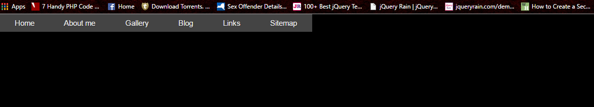
我的浏览器显示的屏幕截图:
最佳答案
好的,首先去掉 html 和正文中的边距/填充
html,body{
  width:100%;height:100%;margin:0;padding:0;
}
然后给 li>a 元素添加一些宽度
.rmm .rmm-main-list li a{
  width:16.7%; /*(100/6 menus %)*/
}
这是一个开始,很多工作建议引导
关于JQuery 响应式菜单全宽,我们在Stack Overflow上找到一个类似的问题: https://stackoverflow.com/questions/31931883/