我想在 python 中绘制带有弯曲箭头的矢量场,这可以在 vfplot(见下文)或 IDL 中完成。
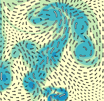
您可以在 matplotlib 中接近,但使用 quiver() 将您限制为直线向量(见左下方),而 streamplot() 似乎不允许有意义控制箭头长度或箭头位置(见右下方),即使更改 integration_direction、density 和 maxlength 也是如此。

那么,是否有一个 python 库可以做到这一点?或者有没有办法让 matplotlib 做到这一点?
最佳答案
如果您查看 matplotlib 中包含的 streamplot.py,在第 196 - 202 行(ish,idk 如果这在版本之间发生了变化 - 我在 matplotlib 2.1.2 上)我们看到以下内容:
 ... (to line 195)
    # Add arrows half way along each trajectory.
    s = np.cumsum(np.sqrt(np.diff(tx) ** 2 + np.diff(ty) ** 2))
    n = np.searchsorted(s, s[-1] / 2.)
    arrow_tail = (tx[n], ty[n])
    arrow_head = (np.mean(tx[n:n + 2]), np.mean(ty[n:n + 2]))
 ... (after line 196)
将那部分改成这样就可以了(改变 n 的赋值):
 ... (to line 195)
    # Add arrows half way along each trajectory.
    s = np.cumsum(np.sqrt(np.diff(tx) ** 2 + np.diff(ty) ** 2))
    n = np.searchsorted(s, s[-1]) ### THIS IS THE EDITED LINE! ###
    arrow_tail = (tx[n], ty[n])
    arrow_head = (np.mean(tx[n:n + 2]), np.mean(ty[n:n + 2]))
 ... (after line 196)
如果您修改它以将箭头放在末尾,那么您可以根据自己的喜好生成更多箭头。
此外,从函数顶部的文档中,我们可以看到以下内容:
*linewidth* : numeric or 2d array
        vary linewidth when given a 2d array with the same shape as velocities.
线宽可以是 numpy.ndarray,如果您可以预先计算出所需的箭头宽度,就可以在绘制箭头时修改铅笔宽度。看起来这部分已经为您完成了。
因此,结合缩短箭头 maxlength、增加密度和添加 start_points,以及调整函数以将箭头放在末端而不是中间,您可以获得所需的图形。
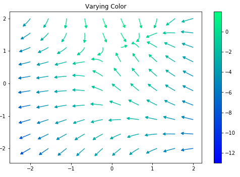
通过这些修改和以下代码,我能够得到更接近您想要的结果:
import numpy as np
import matplotlib.pyplot as plt
import matplotlib.gridspec as gridspec
import matplotlib.patches as pat

w = 3
Y, X = np.mgrid[-w:w:100j, -w:w:100j]
U = -1 - X**2 + Y
V = 1 + X - Y**2
speed = np.sqrt(U*U + V*V)

fig = plt.figure(figsize=(14, 18))
gs = gridspec.GridSpec(nrows=3, ncols=2, height_ratios=[1, 1, 2])

grains = 10
tmp = tuple([x]*grains for x in np.linspace(-2, 2, grains))
xs = []
for x in tmp:
    xs += x
ys = tuple(np.linspace(-2, 2, grains))*grains


seed_points = np.array([list(xs), list(ys)])
# Varying color along a streamline
ax1 = fig.add_subplot(gs[0, 1])

strm = ax1.streamplot(X, Y, U, V, color=U, linewidth=np.array(5*np.random.random_sample((100, 100))**2 + 1), cmap='winter', density=10,
                      minlength=0.001, maxlength = 0.07, arrowstyle='fancy',
                      integration_direction='forward', start_points = seed_points.T)
fig.colorbar(strm.lines)
ax1.set_title('Varying Color')

plt.tight_layout()
plt.show()
tl;dr:复制源代码,并将其更改为将箭头放在每条路径的末尾,而不是中间。然后使用您的流图而不是 matplotlib 流图。
编辑:我得到了不同的线宽
关于python - 使用弯曲(路径跟踪)向量在 python 中进行流可视化,我们在Stack Overflow上找到一个类似的问题: https://stackoverflow.com/questions/51843313/