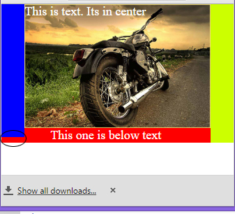
我正在练习流体图像和 div 布局。在下面的代码中,我成功地获得了流畅的图像和流畅的 div。但是,每当将浏览器窗口调整为最小尺寸时,左侧 .leftcolumn 中的一个 div(蓝色的)似乎垂直向下流入底部的红色 div 中。请查看随附的屏幕截图以了解情况。
我知道这个问题可以通过媒体查询来解决。但在这种情况下,我想了解为什么会发生这种情况,以及任何替代解决方案。
html,body {
	margin: 0px;
	height: 100%;
	/* [disabled]width: 100%; */
	left: 0px;
	top: 0px;
	background-color: rgba(255,255,255,1);
	font-size: medium;
}

.wrapper {
	text-align: center;
	margin-top: 0;
	margin-left: auto;
	height: auto;
	max-width: 960px;
	background-color: rgba(0,0,0,1);
	margin-right: auto;
	position: relative;
}


.bigcontainer {
	display: block;
	/* [disabled]border: 1px solid black; */
	margin-top: 0px;
	margin-right: 10%;
	margin-left: 10%;
	background-color: rgba(204,204,204,1);
	max-width: 100%;
	font-size: xx-large;
	color: rgba(255,255,255,1);
	top: 0px;
	height: auto;
	/* [disabled]margin-bottom: -3px; */
	position: relative;
}

img{
	max-width: 100%;
	max-height: 100%;
	/* [disabled]margin-bottom: -9px; */
	display: block;
}

.leftcolumn {
	width: 10%;
	height: 96%;
    background-color: rgba(0,0,255,1);
	position: absolute;
	margin-top: 0px;
	margin-left: 0px;
	left: 0px;
	top: 0px;
	margin-bottom: 10%;
	overflow: hidden;
}

.rightcolumn {
	width: 10%;
	background-color: rgba(204,255,0,1);
	height: 100%;
	position: absolute;
	margin-top: 0px;
	margin-left: 0px;
	top: 0px;
	right: 0px;
}

.text {
	height: auto;
    width: auto;
    color: rgba(255,255,255,1);
    position: absolute;
    margin-left: auto;
    font-size: 18px;
    margin-right: auto;
    top: 0px;
}

.text2 {
	height: 10%;
	width: auto;
	color: rgba(255,255,255,1);
	top: 0px;
	margin-left: 0%;
	font-size: 18px;
	/* [disabled]float: left; */
	margin-right: 10%;
}

.text3 {
	height: auto;
	width: auto;
	color: rgba(255,255,255,1);
	top: 0px;
	margin-left: 5%;
	font-size: 18px;
	background-color: rgba(0,0,255,1);
	float: left;
}
<div class="wrapper">
<div class="leftcolumn"></div>
<div class="rightcolumn"></div>
<div class="bigcontainer">
<img src="http://i1062.photobucket.com/albums/t482/gautam_official/royal-enfield-motorcycle-2x_zpswmyloqvc.jpg" alt="enfield">
<div class="text">This is text. Its in center</div>
</div>
<div class="text2">This one is below text</div>
</div>最佳答案
TL;DR:将 position:relative 设置为 .text2。
发生这种情况是因为您的元素 .text2 未设置 position:relative。默认情况下,他是 position:static,这意味着他没有“定位”(除了 static 之外的任何东西都被认为是定位的)。当一个元素是静态的时,它没有 z-index 并且停留在其他“定位”元素之下。看什么CSS Tricks说一下将位置设置为相对:
"... One is that it introduces the ability to use z-index on that element, which doesn't really work with statically positioned elements. Even if you don't set a z-index value, this element will now appear on top of any other statically positioned element. You can't fight it by setting a higher z-index value on a statically positioned element."
在您的情况下,其他“定位”元素在您的静态 .text2 之上。
"Elements with non-static positioning will always appear on top of elements with default static positioning."
HERE有关定位和 HERE 的更多信息了解 z-index。
对不起我的英语。 :)
根据这个答案的评论,我将尝试详细阐述另一个解决方案。
问题是 .leftcolumn 有 height: 96%。 96% 是与未设置高度的包含 block (.wrapper)相关的百分比。
所以另一种解决方案是将 .leftcolumn 放在 .bigcontainer 中。 .bigcontainer 将容纳 .leftcolumn 和图像。 .leftcolumn 的高度将设置为 100%,现在测量 .bigcontainer 作为包含框(将具有图像高度)。查看代码段:
.wrapper {
	margin: auto;
	max-width: 960px;
	background-color: rgba(0,0,0,1);
	position: relative;
}


.bigcontainer {
	display: block;
	background-color: rgba(204,204,204,1);
	color: rgba(255,255,255,1);
	position: relative;
	max-width: 90%;
	height: 90%;
}

img{
	max-width: 90%;
	max-height:100%;
	margin-left:10%;
	display: block;
}

.leftcolumn {
	width: 10%;
	height: 100%;
	background-color: rgba(0,0,255,1);
	position: absolute;
	left: 0px;
}

.rightcolumn {
	width: 10%;
	background-color: rgba(204,255,0,1);
	height: 100%;
	position: absolute;
	margin-top: 0px;
	margin-left: 0px;
	top: 0px;
	right: 0px;
}

.text {
	height: auto;
	width: auto;
	color: rgba(255,255,255,1);
	position: absolute;
	top: 0px;
	margin-left: 12%;
	font-size: 18px;
}

.text2 {
	height: 10%;
	width: auto;
	color: rgba(255,255,255,1);
	top: 0px;
	margin-left: 0%;
	font-size: 18px;
	margin-right: 10%;
}

.text3 {
	height: auto;
	width: auto;
	color: rgba(255,255,255,1);
	top: 0px;
	margin-left: 5%;
	font-size: 18px;
	background-color: rgba(0,0,255,1);
	float: left;
}
<!DOCTYPE html>
<html lang="pt-BR">
<head>
<title>Teste</title>
<link rel="stylesheet" href="stylesheet.css" type="text/css">
</head>
<body>
<div class="wrapper">
<div class="rightcolumn"></div>
<div class="bigcontainer">
<div class="leftcolumn"></div>
<img src="http://i1062.photobucket.com/albums/t482/gautam_official/royal-enfield-motorcycle-2x_zpswmyloqvc.jpg" alt="enfield">
<div class="text">
This is text. Its in center
</div>
</div>
<div class="text2">
This one is below text
</div>
</div>
</body>
</html>希望这对您有所帮助。 :)
关于html - 流体图像,div 重新定位,我们在Stack Overflow上找到一个类似的问题: https://stackoverflow.com/questions/37709200/