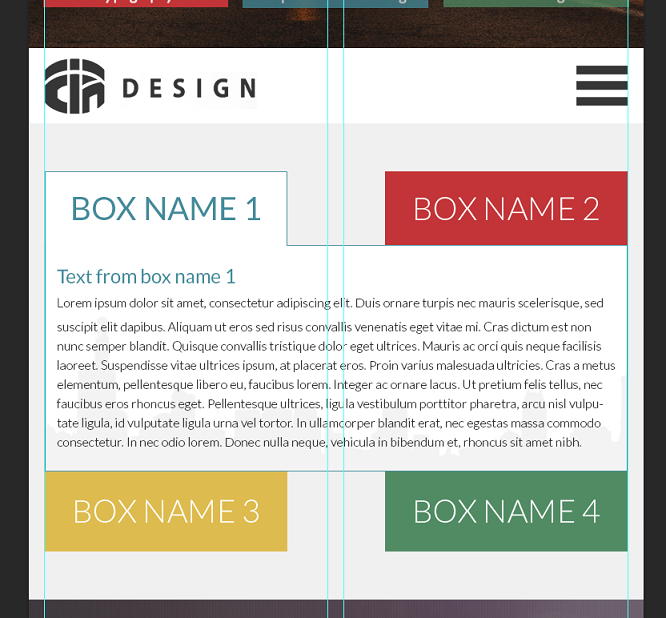
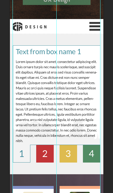
这就是我想要实现的目标(下面添加了图像)。我知道这可以通过媒体查询来完成,只需根据屏幕分辨率添加不同的样式即可。我现在拥有的是智能手机版本(如下所示)。
我不知道如何将这两个框放在平板电脑版本的“mytextbox”div 上方。我尝试了网格、右拉/左拉等不同的组合,但似乎不起作用。我刚刚开始阅读有关 Flexbox 的内容。也许这是一个选择?如果您有任何想法请帮忙。谢谢!
<div class="container">
        <div id="mytextbox" class="col-sm-12 col-xs-12">Text from the box</div>
        <div id="box1" class="col-sm-6 col-xs-3 mybox">BOX NAME1</div>
        <div id="box2" class="col-sm-6 col-xs-3 mybox">BOX NAME2</div>
        <div id="box3" class="col-sm-6 col-xs-3 mybox">BOX NAME3</div>
        <div id="box4" class="col-sm-6 col-xs-3 mybox">BOX NAME4</div>
</div>
在平板电脑上:
在智能手机上:
最佳答案
是的,您可以使用 Flexbox 来实现此目的,准确地说,是 Flex 子项上的 order 属性:
// Create a flex container
.container {
    display: flex;
    // Force default row wrapping behaviour as bootstrap initially intends.
    flex-flow: row wrap;
}

#mytextbox {
    // Make it the 3rd item in the container flow
    order: 3;
}

#box1 {
    order: 1;
}

#box2 {
    order: 2;
}

#box3 {
    order: 4;
}

#box4 {
    order: 5;
}

// 768 is the bootstrap small-media breakpoint
@media screen and (max-width: 768px) {
    #mytextbox {
        // When there's not enough space, make it the first item again
        order: 1;
    }

    #box1 {
        order: 2;
    }

    #box2 {
        order: 3;
    }

    #box3 {
        order: 4;
    }

    #box4 {
        order: 5;
    }
}
See it in action on codepen (因为:bootstrap css支持)
关于html - 根据屏幕分辨率更改 div 位置(flexbox?),我们在Stack Overflow上找到一个类似的问题: https://stackoverflow.com/questions/40910851/