我被分配了重新创建以下网站的任务:https://plantanapp.com/learn
我做了一些事情,但是每次我解决一个问题时,都会出现另外两个问题。
我是HTML和CSS的新手,并不真正了解元素应该在什么地方,何处以及为什么起作用。
这是HTML和CSS:
http://jsfiddle.net/rvgxudt4/
body,html{
    margin: 0px; padding: 0px; border: 0px;
}
.whole {

    width:100%;
    font-family: sans-serif, Arial, Helvetica ;
    color: white;
    background-color: black;
    overflow: hidden;
    margin: 0 auto;

}

.Module_1{
    position: static;
    background-image: url(pixels.png);
    background-color: #0CBF99;
    background-repeat: no-repeat;
    background-size: contain;
    background-position: center;
    max-width: 100%;

    margin: 0 auto;
    width: 100%;
    height: 100vh;
    display: flex;
    flex-wrap: wrap;
    justify-content: center;
    align-items: center;


}

.logo {

    background-size:100%;
    background-repeat:no-repeat;
    background-position: center;
    background-image:url(papp-logo.png);
    width: 200px;
    height: 200px;
    position: relative;
    top: -10%;


}

.content {
    height: 40vh;
    width: 30vw;
    color:white;
    font-weight: 500;
    text-align: left;
    line-height: 4.5vh;
    vertical-align: middle;


}


#Buton1 {

    position: relative;
    background-color: #F47721;
    color:white;
    border: 0px;

    width: 15vw;
    height: 30px;

    min-width: 5vw;
    max-width: 20vw;

    border-radius: 5px;
    line-height: 10px;
    margin: 10pt 0 5pt 0;

    text-decoration: none;
    cursor: pointer;


}


.Module_2{
    background-color: #12686A;
    background-repeat: no-repeat;
    background-size: auto;
    max-width: 100%;
    width: 100%;
    height: 100vh;
    margin: 0 auto;

    display: flex;
    flex-wrap: wrap;
    justify-content: center;
    align-items: center;


}

.Module_3{
    position:relative;
    background-color: #0CBF99;
    background-image: url(example-apps.png);
    background-repeat: no-repeat;
    background-size: contain;
    background-position: center;
    max-width: 100%;
    width: 100%;
    height: 100vh;
    margin: 0 auto;
    display: flex;
    flex-direction: column;
    align-items: center;
}

.Module_4{
    position: relative;
    background-image: url(rules-bg.jpg);
    background-color: #12686A;
    background-repeat: no-repeat;
    background-size: cover;
    background-position: center;
    max-width: 100%;
    width: 100vw;
    height: 100vh;
    margin: 0 auto;
    display: flex;
    flex-direction: column;
    justify-content: center;


}

.the_rules {
    position:relative;
    color:black;
    text-align: center;

    font-weight: bolder;
    align-self:flex-start;
    left:35%;
    bottom:0%;

}

.container_4 {
    position: relative;
    bottom: 90px;
    width: 70%;
    display: flex;
    flex-wrap:wrap;
    justify-content: center;
    align-self: center;
    top:10%;


}

.img_nr_1 {
    position: relative;
    background-image:url(1.png);
    background-size: contain;
    background-repeat: no-repeat;
    background-position: center;
    width: 230px;
    height: 300px;
    align-self: center;
}

.content_pg4_1 {


    height: 15vh;
    width: 26vw;
    color:black;

    font-weight: 200;
    text-align: left;
    line-height: 40px;
    align-self: center;


}


.Module_5{
    position: static;
    background-color: #12686A;
    background-image: url(rules-bg.jpg);
    background-repeat: no-repeat;
    background-size: cover;
    background-position: center;
    max-width: 100%;
    margin: 0 auto;
    width: 100%;
    height: 100vh;
    display:flex;
    flex-direction: column;
    justify-content: center;
    align-items: center;

}

.Module_6 {
    position: static;
    background-color: #12686A;
    background-image: url(rules-bg.jpg);
    background-repeat: no-repeat;
    background-size: cover;
    background-position: center;
    max-width: 100%;
    margin: 0 auto;
    width: 100%;
    height: 100vh;
    display:flex;
    flex-direction: row;
    justify-content: center;


}

.Module_7 {
  position: static;
    background-color: #12686A;
    background-image: url(rules-bg.jpg);
    background-repeat: no-repeat;
    background-size: cover;
    background-position: center;
    max-width: 100%;
    margin: 0 auto;
    width: 100%;
    height: 100vh;
    display:flex;
    flex-direction: row;
    justify-content: center;
    align-items: center;


}

.Module_8{
    background-color: #12686A;
    margin: 0 auto;
    width: 100%;
    height: 100vh;

}

.Module_9{
    position: static;
    background-color: #0CBF99;

    width: 100%;
    height: 100vh;

}

.Module_10{
    background-color: #12686A;
    margin: 0 auto;
    width: 100%;
    height: 100vh;
}

.rectangle {
    position:absolute;
    color:white;
	margin: 0 auto;
    line-height: 30px;

    width: 30vw;
    height: 80px;

    min-width: 5vw;


	background: #F47721;
    bottom:0;
    text-align: center;
    vertical-align: middle;
    top: 75%;


}

.center_title {
    position:relative;

    width: 40%;
    padding: 10px;
    text-align: center;

    color:white;
    top:80px;

}

#chat_bubble {
    background-color: #1ABC9C;
    background-repeat: no-repeat;
    background-position: center;
    background-image: url(chat-bubble-circle-3-512.png);
    background-size: cover;
    margin: 0;
    padding: 0;
    border: 0;
    box-shadow: 0px 5px 12px -3px black ;
    width: 60px;
    height: 60px;
    border-radius: 50%;
    position: fixed;
    left: 94%;
    bottom: -10px;
    transform: translate(-50%, -50%);
    cursor: pointer;
}


#take_me_directly {
    font-size: 13px;
    font-weight: 850;
    color: white;
    text-decoration: none;

}

.what_is {
    background-size: contain;
    background-repeat: no-repeat;
    background-position: center;
    background-image: url(whatis.png);
    width:400px;
    height:300px;
}


.img_nr_2 {
    position: relative;
    background-image: url(2.png);
    background-size: contain;
    background-repeat: no-repeat;
    background-position: center;
    width: 230px;
    height: 300px;
    align-self:center;
}


.img_plant_2 {
    background-image: url(plant-2.png);
    background-size: 100%;
    background-repeat: no-repeat;
    background-position: bottom;
    width:16vw;
    height: 26vh;
    position: relative;
    align-self: flex-end;
    left:-5%;
    top:16%;


}


.content_pg5 {
    position: relative;
    height: 15vh;
    width:30vw;
    color:black;

    text-align:left;
    line-height: 40px;
    align-self: center;


}


.img_nr3 {
    position: relative;
    background-image:url(3.png);
    background-size: contain;
    background-repeat: no-repeat;
    background-position: center;
     width: 230px;
    height: 300px;
    align-self: center;
}

.content_pg6 {
    position: relative;
    text-align: left;
    color: black;
    width: 27vw;
    height: 35vh;

    line-height: 40px;
    align-self: center;

}

#paragraf_pg6 {
    font-size:1.4vw;
}

.img_plant_3 {
    background-image: url(plant-3.png);
    background-repeat: no-repeat;
    background-size: 100%;
    background-position: bottom;
    width:16vw;
    height: 55vh;
    position: relative;
    align-self: flex-end;
    left: 6.5%;
    bottom: -3%;
}

.img_nr4 {
    background-image: url(4.png);
    background-size: contain;
    background-repeat: no-repeat;
    background-position: center;
    width: 230px;
    height: 300px;
    align-self: center;


}

.content_pg7 {
    color: black;
    width:30vw;
    height: 25vh;

    text-align: left;
    align-self: center;
    line-height: 40px;
}

.img_plant_4 {
    background-image: url(plant-4.png);
    background-repeat:no-repeat;
    background-size: 100%;
    background-position: bottom;
    width:16vw;
    height: 200vh;
    position: absolute;
    align-self: flex-end;
    right:5%;
}


.container_5 {
    position: relative;
    width: 690px;
    height: 300px;
    display:flex;
    flex-wrap:wrap;
    justify-content: center;
    left:2%;

}

.container_6 {
    position: relative;
    width: 60vw;
    height: 35vh;
    display:flex;
    flex-wrap:wrap;
    justify-content: center;
    align-self: center;
    left: 9%

}

.container_7 {

    width:50vw;
    display: flex;
    flex-wrap: wrap;
    justify-content: center;
    align-self: center;


}

.img_plant_1 {
    background-image: url(plant-1.png);
    background-repeat: no-repeat;
    background-size: 100%;
    background-position: bottom;
    width:17vw;
    height: 20vh;

    position: absolute;
    bottom:-7%;
    right: 2%;

}

.sign_up {

}

.container_9 {
    position: static;
    display: flex;


}

.container_1 {
    position: relative;
    height: 70vh;
    width: 50vw;
    color:white;
    font-size: 1.7vw;
    font-weight: 500;
    text-align: left;
    display: flex;
    flex-wrap: wrap;
    justify-content: center;
    align-items: center;
}


.text_1 {
    margin: 0;
    padding: 0;
    max-width: 39vw;
    text-align: left;


}
<!DOCTYPE html>
<html>
<head>
<meta charset="utf-8">
<meta name="viewport" content="width=device-width, initial-scale=1.0">
<link href='https://fonts.googleapis.com/css?family=Open+Sans' type='text/css' rel='stylesheet'>
<link href="Style.css" type="text/css" rel="stylesheet">
<link href="media_query_sheet.css" type="text/css" rel="stylesheet">
<title>PlantAnApp</title>
</head>
<body>
<div class="whole">
<div class="Module_1">
<div class="logo"></div>
<div class="text_1">
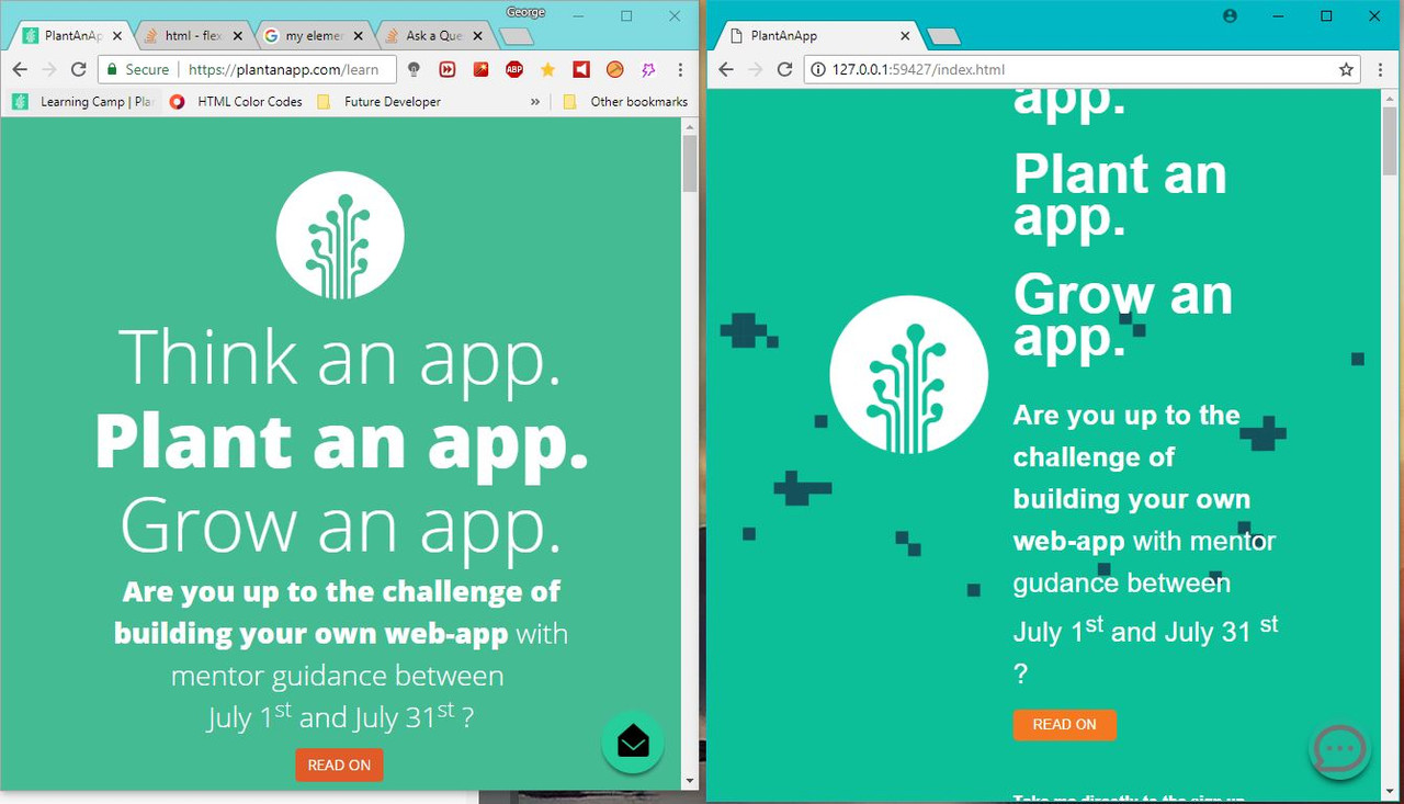
<h1>Think an app.</h1>
<h1><b>Plant an app.</b></h1>
<h1>Grow an app.</h1>
<b>Are you up to the challenge of building your own web-app</b> with mentor gudance between July 1<sup>st</sup> and July 31 <sup>st</sup> ?
<br>
<a href="#Module2"><button type="button" id="Buton1"> READ ON</button></a>
<p><a href="#form1" id="take_me_directly">Take me directly to the sign-up form</a></p>
</div>
</div>
<div class="Module_2" >
<a name="Module2"></a>
<div class="what_is"></div>
<div class="content">
<h1>What is</h1>
<h1>Plant an App?</h1>
Plant an App is a platform that empowers you to build and customize epic web apps, fast and with low/no code requirements.
</div>
</div>
<div class="Module_3">
<div class="center_title"><h1>WHAT CAN YOU BUILD ? </h1></div>
<div class="rectangle"><h1>BASICALLY,</h1>
<p><b>ANYTHING YOU CAN THINK OF</b></p></div>
</div>
<div class="Module_4">
<div class="the_rules"><h1>THE RULES</h1></div>
<div class= "container_4">
<div class="img_nr_1"></div>
<div class= "content_pg4_1">Grab a team mate. This is a learning experience for 2 !</div>
</div>
<div class="img_plant_1"></div>
</div>
<div class="Module_5">
<div class= "container_5">
<div class="img_nr_2"></div>
<div class="content_pg5" >Register your team and idea until the 25 <sup>th</sup> of June.</div>
</div>
<div class="img_plant_2"></div>
</div>
<div class="Module_6">
<div class="container_6">
<div class="img_nr3"></div>
<div class="content_pg6"><p >Build your web-app with mentor guidance between July 1<sup>st</sup> and July 31<sup>st</sup>.</p>
<p id="paragraf_pg6">*some occasional visits to the PlantAnApp office are required</p></div>
</div>
<div class="img_plant_3"></div>
</div>
<div class="Module_7">
<div class="container_7">
<div class="img_nr4"></div>
<div class="content_pg7"><b>See your app grow, have a great learning experience</b> and reap awesome prizes for doing a great job.</div>
</div>
<div class="img_plant_4"></div>
</div>
<div class="Module_8">
</div>
<div class="Module_9">
<div class="container_9">
<div class="sign_up"><h1><b>SIGN UP</b></h1></div>
<div class="button_pg9">LIMITED SLOTS. MAY LUCK BE ON YOUR SIDE !</div>
<div class="form_1">
<a name="form1"></a>
<form>
<h4>The team</h4>
<input type="text" name="Team_Name" placeholder="Your team name" maxlength="20"> <br>
<h4>You</h4>
<input type="text" name="Full_Name_1" placeholder="Your Full Name" maxlength="30"> <br>
<input type="text" name="mail_1" placeholder="Your E-Mail" maxlength="40"> <br>
<input type="text" name="Education_1" placeholder="Your University, Specialization & Year" maxlength="40"> <br>
</form>
</div>
</div>
</div>
<div class="Module_10">
</div>
<button id="chat_bubble"></button>
</div>
</body>
</html>另外,这是“ media_query_sheet”(我刚刚添加了这个):
http://jsfiddle.net/3qhbuypz/
/* Media Query */


/* Extra small devices (phones, 600px and down) */
@media screen and (max-width: 600px) {

    .img_plant_1{
        display: none;
    }
    .img_plant_2{
        display: none;
    }
    .img_plant_3{
        display: none;
    }
    .img_plant_4{
        display: none;
    }
}

/* Small devices (portrait tablets and large phones, 600px and up) */
@media screen and (min-width: 600px) {
    .whole{
        font-size: 4vw;
    }
    .logo{
        width:25vw;
        height: 25vh;
    }
    .text_1{
        width: 40vw;
        line-height: 40px;
    }
}

/* Medium devices (landscape tablets, 768px and up) */
@media screen and (min-width: 768px) {
    .whole{
        font-size: 2vw;
    }
    .logo{
        width:20vw;
        height: 25vh;
    }
    .text_1{
        width: 40vw;
        line-height: 40px;
    }
}

/* Large devices (laptops/desktops, 992px and up) */
@media screen and (min-width: 992px) {
    .whole{
        font-size: 2vw;;
    }
    .logo{
        width:20vw;
        height: 25vh;
    }

}

/* Extra large devices (large laptops and desktops, 1200px and up) */
@media screen and (min-width: 1200px) {
    .whole{
        font-size: 1.85vw;
    }
    .logo{
        width:300px;
        height: 300px;
    }
}
我有一些“理解”问题:
我猜我一直在错误地使用这些类,而且我不知道如何更好地使用它们!
2.元素不会像原始站点那样居中。
flex-wrap:仅当窗口很小时,自动换行
示例:https://s33.postimg.cc/pen7ggevj/Capture.jpg
文字太讨厌了。调整大小时,我无法获得相同的行高;我无法正确调整大小:它总是太大或太小
div不在我希望他们呆的地方!
查看右下角的小消息按钮!无论窗口大小如何,都应该将其固定,但请猜测一下:他移动了!
请帮我 !我已经为此工作了几天,但我不明白自己在哪里或做错了什么,也找不到符合我需要的教程。我发现的所有教程都是胡说八道!
它应该是这样的:
https://media.giphy.com/media/8PySLM55qjM0uWP2B8/giphy.gif
它是这样的:
https://media.giphy.com/media/2tKCZBAUfxIYBWNfjj/giphy.gif
谢谢 !
我只研究HTML和CSS。我不了解JSS或任何其他Java语言。
最佳答案
您的问题有点'太笼统了,也许您应该开始阅读一些书籍,这些书籍将为您提供完成这些工作的基础。无论如何,我会尽力建议您一些可以帮助您的事情:
类名应该是有说服力的,例如容器,部分,包装器,ecc...。我喜欢使用BEM方法来创建可重用且直观的东西。 http://getbem.com/
Flexbox刚开始时可能会有些棘手,但过了一段时间,一切都变得容易了。无论如何,我还是建议您从基础开始(块,内联块,内联,ECC等)。这个YouTube频道可以给您一些建议:https://www.youtube.com/watch?v=G7EIAgfkhmg
这不是最佳实践,但是对于我只喜欢使用“ px”值的文本,无论如何,请不要忘记每个标记都有其默认值和字体粗细大小。
如果您不确定自己在做什么,Div永远不会待在您想要的地方:D
不是按钮在移动,而是容器在根据高度而变小,您应该使用min-height:100vh而不是固定高度100vh,因为这种高度取决于窗口的高度。
同样,原始站点也有此问题,如果您调整窗口高度的大小,则每个部分中的元素将悬于下一个部分。
我的建议是忘记绝对位置,仅使用flexbox,您可以使用一种可能是这样的布局来处理几乎整个站点:
/* Reset all browsers default values */
* {
  padding: 0;
  margin: 0;
  }
img {
  border:none;
  }

/* Style */

.section {
  align-items: center; /* Vertical center first row of flex element, default value is STRETCH */
  display: flex;
  flex-direction: row;
  flex-wrap: wrap;
  width: 100%;
  height: auto;
  min-height: calc(100vh - 80px); /* Remove padding 40px top and bottom */
  background-color: #45BB94;
  padding: 40px 0; /* Prevent the content to touch the border of the section when window height is resized */
}
.wrapper {
  display: flex;
  flex-direction: row;
  flex-wrap: wrap;
  width: 100%;
  max-width: 70%;
  background-color: #424242; /* Use background could help you understand what happen to the element */
  margin: 0 auto; /* Horizontal centering div */
}
.img-container {
  display flex;
  flex-direction: row;
  flex-wrap: wrap;
  width: 20%; /* this could be img width */
  min-height: 100%;
  background: lightblue;
}
.logo {
  display: block;
  max-width: 100%;
  height: auto;
  /* This code will transform image to responsive */
}
.text-container {
  display: flex;
  flex-direction: row;
  flex-wrap: wrap;
  width: 80%;
  min-height: 100%;
  background-color: lightcoral;
}
<div class="section">
<div class="wrapper">
<div class="img-container">
<img class="logo" src="https://plantanapp.com/Portals/_default/Skins/PlantanappLanding/Landing/papp-logo.svg">
</div>
<div class="text-container">
<p>Lorem ipsum dolor sit amet
Lorem ipsum dolor sit amet
Lorem ipsum dolor sit amet
Lorem ipsum dolor sit amet
</p>
</div>
</div><!--wrapper-->
</div><!--section-->
<!--use comment at the end of an element help you understand what tag is-->希望对您有所帮助。
关于html - flex-wrap:wrap;不能让他们工作,我们在Stack Overflow上找到一个类似的问题: https://stackoverflow.com/questions/51005414/