我对响应式网站设计(通常是前端开发)非常陌生,我正在尝试创建一个基本的小 Angular 聊天应用程序,使用 Bootstrap ,在整个设计过程中都考虑到响应性。然而,当我开始嵌套 flex 盒子时遇到了很多问题,我想我只是没有完全理解它。理想情况下,这些是我在更大和更小的设备上的看法。
大:
小型设备(注意我没有做任何事情来将设置更改为按钮):
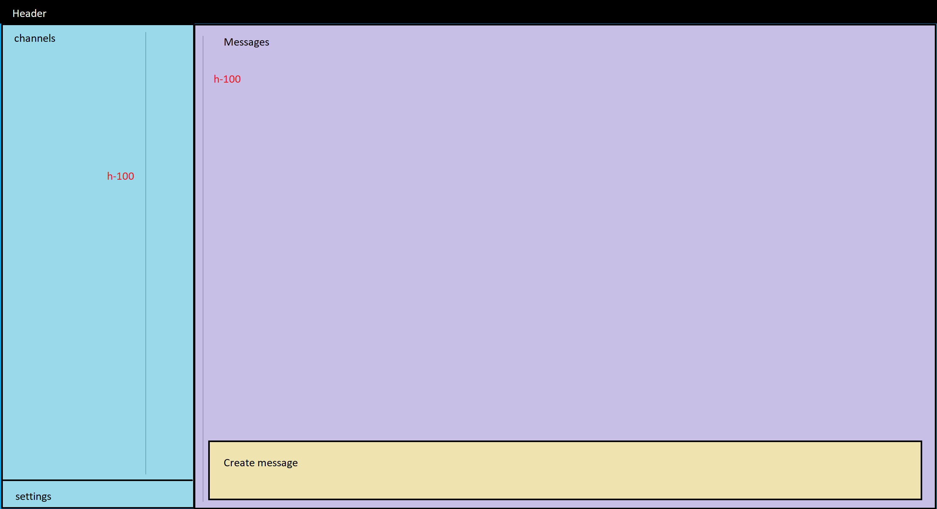
这是我在使用 h-100 时得到的真实情况(我没有看到任何内置的高度响应类,但我可能完全错了):
我认为我理解这个问题,我将 h-100 与 col-12 一起使用,因此左侧占据了所有空间,右侧被分流到页面之外。我曾尝试使用 flex-fill 和 flex-grow-1 获得相同的外观,但它们似乎对实际文档没有任何作用。这是我的代码:
<app-header></app-header>
<div class="container-fluid" id="mainContent">
    <div class="row h-100 flex-column-reverse flex-md-row">
      <div class="col-md-3 col-12 flex-fill">
        <div class="d-flex flex-column h-100 justify-content-between">
          <div>
              <app-channels></app-channels>
          </div>
          <div>
              <app-settings></app-settings>
          </div>
        </div>
      </div>
      <div class="col-md-9 col-12">
        <app-messages></app-messages>
      </div>
    </div>
</div>
(应用消息也使用 h-100 来填充屏幕)
自定义 scss:
@import "../node_modules/bootstrap/scss/bootstrap";

html, body {
    height: 100% !important;
    width: 100% !important;
}
有没有一种方法可以让我使用纯 flexbox 而不是使用 h-100 在上面发布的 View 之间切换此内容?或者是否有像 h-sm-100 这样的响应类,以便它只在 small 和 above 上使用 100% 高度?
感谢您的宝贵时间。
最佳答案
对于高度,您可能必须自己动手...这并不像您在 this Angular demo 中看到的那么复杂
以下代码有助于生成您需要的内容..
CSS 部分:
.outsideDiv{ overflow-y:hidden;}
.app-header { height:10vh; background:#000; color:#fff;}
.myHeight{  background: lightgray; }
.mySection{padding:0; }

.app-messages {  background: #c7b6c7;}
.createMessage{background: lightyellow; margin: 1%; position: absolute; bottom: 0px; width: 98%; }
.app-settings {  background:blue; }
.app-channels {  background:#b3fbfb;}

@media SCREEN AND (min-width: 768px){
  .myHeight{ height:90vh;  }
  .app-channels { height: 80%; }
  .app-messages { height: 100%; }
  .app-settings { height: 20%;  }
}
@media SCREEN AND (max-width: 767px){
  .myHeight{ height:auto;  }
  .myHeightSection1 { height:20vh;}
  .myHeightSection2 { height:70vh;}
  .app-channels { height: 100% }
  .app-messages { height: 100%; }
  .app-settings { height: 5%;  width:20%; position:fixed; right:0; bottom:0; }
}
HTML部分:
<div class='outsideDiv'>

    <div class="app-header">
        <app-header>
        </app-header>
    </div>
    <div class="container-fluid" id="mainContent">
        <div class="row">
            <div class="col-lg-3 col-md-3 col-sm-12 col-12 d-flex flex-column mySection">
                <div class="d-flex flex-column h-100 justify-content-between order-last">
                    <div class='myHeight myHeightSection1'>
                        <div class="app-channels">
                            <app-channels></app-channels>
                        </div>
                        <div class="app-settings">
                            <app-settings></app-settings>
                        </div>
                    </div>
                </div>
            </div>
            <div class="col-lg-9 col-md-9 col-sm-12 col-12 order-first order-lg-2 order-md-2 mySection">
                <div class='myHeight myHeightSection2'>
                    <div class="app-messages">
                        <app-messages></app-messages>
                        <div class='createMessage'>Create Message</div>
                    </div>
                </div>
            </div>
        </div>
    </div>

</div>
关于html - Bootstrap 4,如何使用 "no scroll"在 SPA 上获得响应高度?,我们在Stack Overflow上找到一个类似的问题: https://stackoverflow.com/questions/55425850/