所以我遇到了一些困难。我对某些文本使用关键帧发光,但我还需要应用文本轮廓。这在 CSS 中可能吗?
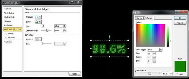
请见附件。文本是绿色的,因此找到一种颜色来很好地补充它已经够难的了。我在 Excel 中演示了一些内容,并找到了我喜欢的内容,但不确定如何在 CSS 中重新创建它。
这是我想要的:
 http://www.flickr.com/photos/68814612@N05/8560198200/
这是我到目前为止使用的代码:
.metric {
    font-size: 240%;
    font-family:Arial Narrow;
    font-weight:700;
    color:#138200;

    text-shadow: -1px -1px 0 #92d050, 1px -1px 0 #92d050, -1px 1px 0 #92d050, 1px 1px 0 #92d050;
    -webkit-animation-name: glow;
    -webkit-animation-duration: 3s;
    -webkit-animation-iteration-count: infinite;
    -webkit-animation-timing-function: linear;
}


@-webkit-keyframes glow {

    0% { text-shadow: 0 0 4px green; }
    50% {text-shadow: 0 0 20px rgba(19,130,0, 0.5), 0 0 20px rgba(19,130,0, 0.5), 0 0 20px rgba(19,130,0, 0.6),0 0 15px rgba(19,130,0, 0.6) ;}
    100% { text-shadow: 0 0 4px green; }
        }
最佳答案
仅供后人引用,以下是我针对上面 Jeff 的提议所做的操作:
http://jsfiddle.net/Osceana/cNYZa/
HTML:
<div id="Percentage">
    <div class="metric">98.3%</div>
    <div class="metric2">98.3%</div>
</div>
然后我只需在 CSS 中设置关键帧发光:
.metric {
    position: absolute;

    font-size: 37pt;
    font-family:Segoe UI Light;
    color:#138200;

    text-shadow: -1px -1px 0 #92d050, 1px -1px 0 #92d050, -1px 1px 0 #92d050, 1px 1px 0 #92d050;
    -webkit-animation-name: glow;
    -webkit-animation-duration: 3s;
    -webkit-animation-iteration-count: infinite;
    -webkit-animation-timing-function: linear;
}


@-webkit-keyframes glow {

    0% { text-shadow: 0 0 20px rgba(19,130,0, 0.7); }
    50% {text-shadow: 0 0 20px rgba(19,130,0, 0.7), 0 0 20px rgba(19,130,0, 1), 0 0 20px rgba(19,130,0, 1),0 0 20px rgba(19,130,0, 1),0 0 20px rgba(19,130,0, 1),0 0 20px rgba(19,130,0, 1), 0 0 30px rgba(19,130,0, 1);}
    100% { text-shadow: 0 0 20px rgba(19,130,0, 0.5)/*0 0 4px green*/; }
        }


.metric2 {
    position:absolute;

    font-size: 37pt;
    font-family:Segoe UI Light;
    color:#138200;

    text-shadow: -1px -1px 0 #92d050, 1px -1px 0 #92d050, -1px 1px 0 #92d050, 1px 1px 0 #92d050;

}
关于css - CSS 中的发光文本 + 文本轮廓(已使用文本阴影进行发光),我们在Stack Overflow上找到一个类似的问题: https://stackoverflow.com/questions/15437048/