我需要使用flexbox进行以下设计。由于编程要求,我无法使用 table 或 dispay:table
我无法将文本垂直居中并在所有容器中保持相同的高度:
https://jsfiddle.net/kurtko/2fq6kn6m/
我正在尝试使用以下元素:
align-self:center;
或者到容器:
align-items:center;
但是我在所有容器中失去了相同的高度。
有什么想法吗?
最佳答案
您可以在 .one 上添加 display: flex align-items: center justify-content: center .small .medium
.item {
display: flex;
text-align: center;
}
.one,
.small,
.medium {
display: flex;
align-items: center;
justify-content: center;
}
.one {
align-items: flex-start;
}
.one {
width: 39%;
margin-right: 1%;
background-color: black;
color: white;
}
.two {
width: 29%;
margin-right: 1%;
}
.three {
width: 40%;
}
.medium {
background-color: grey;
color: white;
margin-bottom: 3px;
height: 200px;
}
.small {
background-color: #c0b55a;
color: white;
margin-bottom: 3px;
height: 100px;
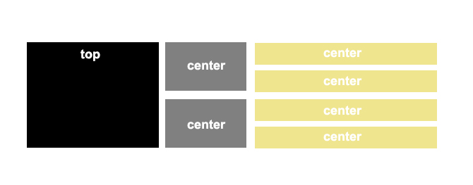
}<div class="item">
<div class="one">
Top
</div>
<div class="two">
<div class="medium">Center</div>
<div class="medium">Center</div>
</div>
<div class="three">
<div class="small">Center</div>
<div class="small">Center</div>
<div class="small">Center</div>
<div class="small">Center</div>
</div>
</div>关于css - 使用 Flexbox 垂直居中文本并保持容器高度相同,我们在Stack Overflow上找到一个类似的问题: https://stackoverflow.com/questions/36597705/