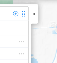
我想组合两个形状及其阴影,创建如下所示的 UI。
在我的尝试中,第一个元素的阴影会与第二个元素重叠。
有什么想法可以跨浏览器实现吗?
HTML
<div class="mainShape">
  <div class="subShape">

  </div>
</div>
CSS
.mainShape {
  position: relative;
  box-shadow: 6px 0 21px -3px rgba(86,93,111,0.12);
  background: white;
  width: 200px;
  height: 600px;
}

.subShape {
  position: absolute;
  top: 0px;
  right: -60px;
  width: 60px;
  height: 180px;
  box-shadow: 6px 0 21px -3px rgba(86,93,111,0.12);
}
最佳答案
可能有更优雅的方法来做到这一点,例如 Sumurai 建议使用 svg,但实现此目的的一种相当 hacky 的方法可能是在两者之间粘贴一个“屏蔽”div(具有白色背景)其他div:
.mainShape {
  position: relative;
  box-shadow: 6px 0 21px -3px rgba(86,93,111,0.12);
  background: white;
  width: 200px;
  height: 600px;
}

.subShape {
  position: absolute;
  top: 0px;
  right: -60px;
  width: 60px;
  height: 180px;
  box-shadow: 6px 0 21px -3px rgba(86,93,111,0.12);
}

.mask {
  position: absolute;
  top:0px;
  right:-20px;
  width:25px;
  height:180px;
  background-color:white;
}
<div class="mainShape">
<div class="subShape">
</div>
<div class="mask">
</div>
</div>关于CSS不规则形状,结合阴影,我们在Stack Overflow上找到一个类似的问题: https://stackoverflow.com/questions/50843676/