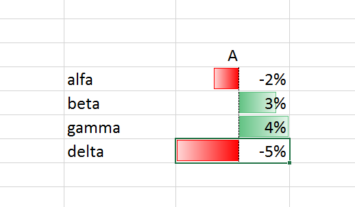
对于我的 Pandas 数据框 (python) 的 html 表示,我想创建尽可能类似于下图(使用 Excel 创建)的东西,也就是说,给定一个序列数字,创建INSIDE A TABLE,一些水平条形图,如果值大于零,则变为绿色,如果低于零,则变为红色,并且轴中的“零”点会根据动态重新缩放到提供的数据。我最接近的是使用 pandas native instruments 由下面的代码给出(http://pandas.pydata.org/pandas-docs/stable/style.html)
#done in Jupyter
from pandas import DataFrame

df = pd.DataFrame([-0.02, 0.03, 0.04, -0.05], columns=['A'])

more_than_zero = df.loc[df.loc[:,'A'] >= 0].index.values.tolist()
less_than_zero = df.loc[df.loc[:,'A'] < 0].index.values.tolist()

df.style.bar(subset=pd.IndexSlice[more_than_zero,'A'], color='#d65f5f')
#df.style.bar(subset=pd.IndexSlice[less_than_zero, 'B'], color='#7fff00')
最佳答案
更新:这个答案导致拉取请求 pandas-dev/pandas#14757在 Pandas v0.20.0 中被接受。该文档可以在 Pandas 网站上找到,网址为 style.html#Bar-charts。
目前无法使用 pandas 开箱即用(我会尽快实现),但现在这里有一个猴子修补解决方案:
def _bar_center_zero(self, s, color_positive, color_negative, width):

    # Either the min or the max should reach the edge (50%, centered on zero)
    m = max(abs(s.min()),abs(s.max()))

    normed = s * 50 * width / (100 * m)

    base = 'width: 10em; height: 80%;'

    attrs_neg = (base+ 'background: linear-gradient(90deg, transparent 0%, transparent {w}%, {c} {w}%, '
                 '{c} 50%, transparent 50%)')

    attrs_pos = (base+ 'background: linear-gradient(90deg, transparent 0%, transparent 50%, {c} 50%, {c} {w}%, '
                 'transparent {w}%)')

    return [attrs_pos.format(c=color_positive,  w=(50+x)) if x > 0
                else attrs_neg.format(c=color_negative, w=(50+x))
                    for x in normed]

def bar_excel(self, subset=None, axis=0, color_positive='#5FBA7D',
                  color_negative='#d65f5f', width=100):
    """
    Color the background ``color`` proptional to the values in each column.
    Excludes non-numeric data by default.
    .. versionadded:: 0.17.1
    Parameters
    ----------
    subset: IndexSlice, default None
        a valid slice for ``data`` to limit the style application to
    axis: int
    color_positive: str
    color_negative: str
    width: float
        A number between 0 or 100. The largest value will cover ``width``
        percent of the cell's width
    Returns
    -------
    self : Styler
    """
    #subset = _maybe_numeric_slice(self.data, subset)
    #subset = _non_reducing_slice(subset)

    self.apply(self._bar_center_zero, axis=axis, subset=subset,
               color_positive=color_positive, color_negative=color_negative,
               width=width)
    return self
Monkey-patch 到 Styler 类:
pd.formats.style.Styler._bar_center_zero = _bar_center_zero
pd.formats.style.Styler.bar_excel = bar_excel
现在你可以使用它了:
df = pd.DataFrame([-0.02, 0.03, 0.04, -0.05], columns=['A'])

df.style.bar_excel(color_positive='#5FBA7D', color_negative='#d65f5f')

更新:
从那以后我创建了一个 pull request在 GitHub 上我实现了这个以及“动态”居中的选项(align='mid')。
您可以通过指定选项 align 并根据您的数据类型获得的结果条如下所示:

关于html - 条件双极内表条形图 - Pandas - CSS,我们在Stack Overflow上找到一个类似的问题: https://stackoverflow.com/questions/40781851/