我正在使用 Bootstrap 表单,试图使其在水平和垂直方向上均可调整大小。使用简单的 CSS,我有:
.form-group-description{
    resize: both;
    overflow: auto;
    width: 50%;

}
这将使我可以水平而不是垂直调整大小。我试过只使用 resize: vertical; 但这也不起作用。
有什么想法吗?你可以在 http://impissed.co/ 看到我在说什么 我会离开网站,直到我得到一些帮助(这是描述框)
编辑:我将其更改为使用 textarea 而不是 html 中的输入。但是,现在当您向右调整大小并移回左侧时,表单将保持向右移动。这是 html:
<div class="form-group-description form-group-lg">
    <textarea rows="4" cols="50" type="text" class="form-control" placeholder="Description"> </textarea>
</div>
最佳答案
最小的、完整的和可验证的例子
这似乎是一个浏览器 bug on chrome - FF 很好,IE doesn't implement css:resize ).
您可以通过左右拖动缩放器,使用以下代码简单地重现它。它会在固定的左侧位置向右调整大小,但在缩小时会尝试居中:
任何可调整大小的 textarea 都会发生这种情况用display:block在 center 里面元素。
<center>
  <textarea style="display:block"></textarea>
</center> 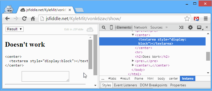
解决方案
修复 1:Bootstrap 设置 display对于任何 .form-control至 block .你需要把它休息到inline-block , 文本区域的 initial显示。
textarea.form-control {
  resize: both;
  display: inline-block;
  width: 50%;
}
<link href="//cdnjs.cloudflare.com/ajax/libs/twitter-bootstrap/3.3.2/css/bootstrap.css" rel="stylesheet"/>
<center>
<textarea rows="4" cols="50" type="text"
class="form-control" placeholder="Description">
</textarea>
</center>修复 2(首选): <center >元素实际上已被弃用,因此您应该使用 css 属性 text-align:center反而。请注意,现在您需要将显示声明为 inline-block 以使其在父 div 中正确居中。
textarea.form-control {
  resize: both;
  display: inline-block;
  width: 50%;
}
<link href="//cdnjs.cloudflare.com/ajax/libs/twitter-bootstrap/3.3.2/css/bootstrap.css" rel="stylesheet"/>
<div class="text-center">
<textarea rows="4" cols="50" type="text"
class="form-control" placeholder="Description">
</textarea>
</div>关于html - CSS Resize 适用于水平但不适用于垂直?,我们在Stack Overflow上找到一个类似的问题: https://stackoverflow.com/questions/29306297/