下面的两个图传达了大致相同的信息。
左边是一个直方图,其中 Y 轴代表频率(即我们看到与每个 bin 相关的范围内的值的频率)。
右边的是密度(KDE 估计)。 Y 轴代表密度(积分加起来应为 1)。
我通常更喜欢密度图(您可以调整,但 Y 轴通常更难以解释。
我知道假设变量的域范围从 -Inf 到 Inf,KDE 估计将返回加起来为 1 的密度,但是有什么方法可以将 KDE 估计产生的 PDF 映射到频率(例如按比例放大)具有频率的值)?
这只是轴“缩放”的问题吗?或者还有什么其他的关系吗?

最佳答案
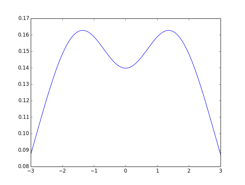
您必须先计算密度点,然后再绘图。阅读 http://scikit-learn.org/stable/modules/density.html 。一些代码:
from sklearn.neighbors.kde import KernelDensity
import numpy as np
import matplotlib.pyplot as plt

# This X is your data for the histogram
X = np.array([[-1, -1], [-2, -1], [-3, -2], [1, 1], [2, 1], [3, 2]])
X = X.reshape(-1, 1)

kde = KernelDensity(kernel='gaussian', bandwidth=1).fit(X)
x = np.linspace(X.min(), X.max(), 100).reshape(-1, 1)

density = np.exp(kde.score_samples(x))

plt.plot(x, density)
plt.show()
关于python - 密度与频率,我们在Stack Overflow上找到一个类似的问题: https://stackoverflow.com/questions/25684148/