我认为我的目标很简单。但是我还没有在某个地方检查我隐藏的错误。
我在学习PLA(Perceptron Linear Algorithm),并试图用Python语言实现它。
算法本身已经制定出来了。然后,我想通过算法绘制调整过程。
数据集
dataset = np.array([
((1, -0.4, 0.3), -1),
((1, -0.3, -0.1), -1),
((1, -0.2, 0.4), -1),
((1, -0.1, 0.1), -1),
((1, 0.9, -0.5), 1),
((1, 0.7, -0.9), 1),
((1, 0.8, 0.2), 1),
((1, 0.2, -0.6), 1)])
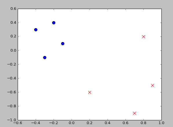
I want to plot the scatter point with different style by the label("-1" or "1" in this example)
所以,这是我编写的代码:
def marker_choice(s):
    if s == 1:
        marker = "o"
    else:
        marker = "x"
    return marker

def color_choice(s):
    if s == 1:
        color = "r"
    else:
        color = "b"
    return color


ps = [v[0] for v in dataset]
label = [v[1] for v in dataset]

fig = plt.figure()
ax = fig.add_subplot()

ax.scatter([v[1] for v in ps], [v[2] for v in ps], s=80, \
           c=color_choice(v for v in np.array(label)),
           marker=marker_choice(v for v in np.array(label)),
       )

目标
最佳答案
问题是您的单行循环没有产生您需要的输出。如果你只是运行它们来测试它们的输出,那么结果是 color:'b' 和 marker:'x' 这解释了为什么你的输出是这样的。
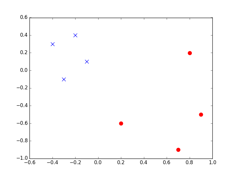
下面的解决方案不使用单行循环,但会生成所需的图形。需要注意的一件事是,下面代码输出上的标记与问题中所需输出中的标记是错误的。这只是更改 marker_choice(s) 函数并将 if s==1 更改为 if s == -1 的情况。
import matplotlib.pyplot as plt
import numpy as np

dataset = np.array([
((1, -0.4, 0.3), -1),
((1, -0.3, -0.1), -1),
((1, -0.2, 0.4), -1),
((1, -0.1, 0.1), -1),
((1, 0.9, -0.5), 1),
((1, 0.7, -0.9), 1),
((1, 0.8, 0.2), 1),
((1, 0.2, -0.6), 1)])

def marker_choice(s):
    if s == 1:       # change to -1 here to get the markers the other way around
        marker = "o"
    else:
        marker = "x"
    return marker

def color_choice(s):
    if s == 1:
        color = "r"
    else:
        color = "b"
    return color

ps = [v[0] for v in dataset]
label = [v[1] for v in dataset]

str_label = []
str_marker = []

for i in (label):
    a = color_choice(label[i])
    str_label.append(a)
    b = marker_choice(label[i])
    str_marker.append(b)

fig, ax = plt.subplots()

for i in range (len(ps)):
    data = ps[i]
    data_x = data[1]
    data_y = data[2]
    ax.scatter(data_x,data_y, s=80, color = str_label[i], marker=str_marker[i])

plt.show()
这会产生以下输出:
注意:我没有测试这段代码的性能与您的原始代码相比如何。
关于python - 通过数据集标签定义标记和颜色设置,我们在Stack Overflow上找到一个类似的问题: https://stackoverflow.com/questions/38430844/