假设我有以下观察结果:
1,2,3,4,5,6,7,100
现在我想绘制一个图观察值如何按百分比分布:
- 前 12.5% 的观测值 <=1(8 中的 1)
- 前 50% 的观察结果为 <=4(4 中的 4)
- 前 87.5% 的观察结果为 <=7(8 中的 7)
- 前 100% 的观测值 <=100(8 分中的 8 分)
我的问题:
- 这样的情节怎么称呼? (那么 y 轴上每个百分位数的最大观察值,x 轴上的百分位数?)。一种直方图?
- 如何在 Matplotlib/Numpy 中创建此类绘图?
谢谢
最佳答案
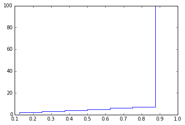
我不确定这样的图会被称为什么(编辑:看起来它被称为累积频率图,或类似的东西)。然而,这很容易做到。
本质上,如果您对数据进行了排序,那么观察值 <= 索引 i 处的值的百分比就是 (i+1)/len(data)。使用满足此条件的 arange 创建 x 数组很容易。因此,例如:
from matplotlib import pylab
import numpy as np
a = np.array([1,2,3,4,5,6,7,100])
pylab.plot( np.arange(1,len(a)+1)/len(a), a,    # This part is required
            '-', drawstyle='steps' )            # This part is stylistic
给予:
如果您希望 x 轴从 0 到 100 而不是 0 到
另请注意,这适用于您的示例数据,因为它已经排序。如果您使用未排序的数据,请先对其进行排序,例如使用 np.sort:
c = np.random.randn(100)
c.sort()
pylab.plot( np.arange(1,len(c)+1)/len(c), c, '-', drawstyle='steps' )

关于python - numpy/matplot : How to plot First X% is in range Y%?,我们在Stack Overflow上找到一个类似的问题: https://stackoverflow.com/questions/35716746/