我制作了一个包含 1fr 1fr 1fr 行的网格模板。在中间一行,有一个内联图像列表。
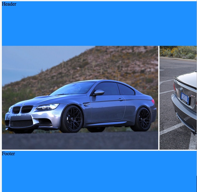
在 Chrome 和 Firefox 中,图像遵循网格行的高度并适当调整。但是,在 Safari 10.1.2 和 Safari TP 31 中,似乎存在图像溢出行和未适当缩放图像宽度的组合。
也许我做错了什么?或者这是一个 Safari 错误?如果是这样,是否有解决方法?
Safari 10.1
Safari 浏览器
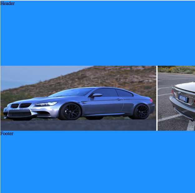
Chrome 60
#grid {
  height: 100vh;
  display: grid;
  grid-template-rows: 1fr 1fr 1fr;
}

#thumbnailContainer {
  position: inherit;
  overflow-x: auto;
  overflow-y: hidden;
  white-space: nowrap;
}

img {
  display: inline;
  height: 100%;
  width: auto;
}

header,
footer {
  background-color: dodgerblue;
}
<div id="grid">
<header>Header</header>
<div id="thumbnailContainer">
<img src="https://c2.staticflickr.com/8/7591/16903911106_b7ced9d758.jpg">
<img src="https://c1.staticflickr.com/9/8740/16927517701_810fcb2a7c.jpg">
<img src="https://c2.staticflickr.com/8/7637/16902583636_15138a68f0.jpg">
<img src="https://c2.staticflickr.com/8/7614/16927530091_6755845b13.jpg">
<img src="https://c1.staticflickr.com/9/8700/16741099010_d0ecd9df1f.jpg">
<img src="https://c1.staticflickr.com/9/8745/16927567841_74fd20d01d.jpg">
</div>
<footer>Footer</footer>
</div>最佳答案
简答
问题是 Safari 无法识别 height: 100%在 img 上元素。
解释
这不是 Safari 的错误。这只是对规范的不同解释。
在处理百分比高度时,一些浏览器(如 Safari)遵循规范的传统解释,这需要在父级上定义高度。
10.5 Content height: the
heightproperty
<percentage>Specifies a percentage height. The percentage is calculated with respect to the height of the generated box's containing block. If the height of the containing block is not specified explicitly (i.e., it depends on content height), and this element is not absolutely positioned, the used height is calculated as if
autowas specified.
换句话说,只有当父元素具有定义的高度时,才会识别流入元素的百分比高度。
一些浏览器,如 Chrome 和 Firefox,已经超越了这种解释,现在接受 flex 和 grid 高度作为具有百分比高度的 child 的足够父引用。
但是 Safari 停留在过去。这并不意味着它是错误的、无效的或错误。
CSS 的最后一次实质性更新height定义是在 1998 年 (CSS2)。从那时起,有了这么多新的 CSS 属性和技术,这个定义已经过时、不清楚,而且非常不完整。在为现代使用更新定义之前,可以预期浏览器呈现变化。
解决方案
因为 Safari 无法识别 height: 100%在 img 上元素,并且您不能在父元素 ( #thumbnailContainer ) 上指定高度,因为该高度由 grid-template-rows: 1fr 定义在顶级容器上,您可以尝试使用 flexbox。
通过制作#thumbnailContainer一个 flex 容器,您可以使用 flex 属性定义图像(flex 元素)的大小。
#grid {
  height: 100vh;
  display: grid;
  grid-template-rows: 1fr 1fr 1fr;
}
#thumbnailContainer {
  display: flex;
  overflow-x: auto;
  overflow-y: hidden;
  min-width: 0;
  min-height: 0;
}
img {
  flex: 0 0 35%;
  min-width: 0;
  object-fit: cover;
}
header, footer {
  background-color: dodgerblue;
}
<div id="grid">
<header>Header</header>
<div id="thumbnailContainer">
<img src="https://c2.staticflickr.com/8/7591/16903911106_b7ced9d758.jpg">
<img src="https://c1.staticflickr.com/9/8740/16927517701_810fcb2a7c.jpg">
<img src="https://c2.staticflickr.com/8/7637/16902583636_15138a68f0.jpg">
<img src="https://c2.staticflickr.com/8/7614/16927530091_6755845b13.jpg">
<img src="https://c1.staticflickr.com/9/8700/16741099010_d0ecd9df1f.jpg">
<img src="https://c1.staticflickr.com/9/8745/16927567841_74fd20d01d.jpg">
</div>
<footer>Footer</footer>
</div>jsFiddle
更多信息
关于html - CSS 网格行高 Safari Bug,我们在Stack Overflow上找到一个类似的问题: https://stackoverflow.com/questions/44770074/