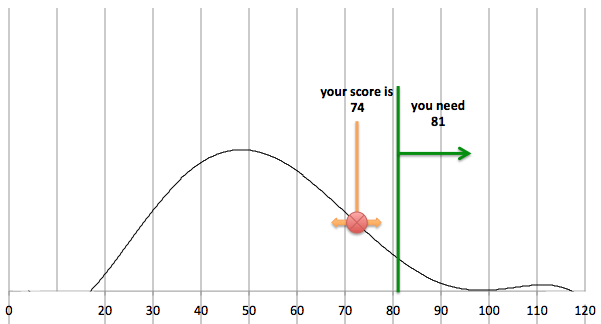
我想在散点图中添加垂直线,例如此图表中的橙色和绿色线:
这是我用于图表的代码示例。
<script type="text/javascript">
 google.setOnLoadCallback(drawChart);
 function drawChart() {
   var data = google.visualization.arrayToDataTable([
     ['Score', 'Repeat'],
     [1 ,0], [2 ,0], [3 ,0], [4 ,0], [5 ,0], [6 ,0], [7 ,0], [8 ,0], [9 ,0], [10 ,0], [11 ,0], [12 ,0], [13 ,0], [14 ,1], [15 ,0], [16 ,0], [17 ,0], [18 ,0], [19 ,0], [20 ,0], [21 ,1], [22 ,0], [23 ,2], [24 ,1], [25 ,1], [26 ,1], [27 ,5], [28 ,2], [29 ,4], [30 ,5], [31 ,1], [32 ,5], [33 ,12], [34 ,8], [35 ,5], [36 ,8], [37 ,15], [38 ,11], [39 ,4], [40 ,11], [41 ,15], [42 ,13], [43 ,9], [44 ,12], [45 ,7], [46 ,12], [47 ,6], [48 ,11], [49 ,9], [50 ,17], [51 ,10], [52 ,11], [53 ,9], [54 ,13], [55 ,8], [56 ,7], [57 ,3], [58 ,11], [59 ,5], [60 ,7], [61 ,8], [62 ,8], [63 ,8], [64 ,7], [65 ,7], [66 ,10], [67 ,9], [68 ,4], [69 ,9], [70 ,5], [71 ,1], [72 ,4], [73 ,5], [74 ,4], [75 ,2], [76 ,4], [77 ,3], [78 ,2], [79 ,2,], [80 ,2], [81 ,2], [82 ,1], [83 ,4], [84 ,3], [85 ,3], [86 ,2], [87 ,1], [88 ,1], [89 ,1], [90 ,0], [91 ,1], [92 ,0], [93 ,0], [94 ,1], [95 ,0], [96 ,0], [97 ,1], [98 ,1], [99 ,0], [100 ,0], [101 ,0], [102 ,1], [103 ,0], [104 ,0], [105 ,0], [106 ,0], [107 ,0], [108 ,0], [109 ,0], [110 ,1], [111 ,0], [112 ,0], [113 ,0], [114 ,0], [115 ,0], [116 ,0], [117 ,0], [118 ,0], [119 ,0], [120 ,0] ]);
   var options = {
     title: 'Test',
     legend: 'none',
     series: [{color:'black', visibleInLegend:false, pointSize:1}],
     annotation: {'column_id': {style: 'line'}},
     tooltip: { trigger: 'none' },
     trendlines: {
       0: {
         type: 'polynomial',
         degree: 6,
         visibleInLegend: true,
         color: 'blue'
       }
     }
   };

   var chart = new google.visualization.ScatterChart(document.getElementById('polynomial2_div'));
   chart.draw(data, options);
 }
 </script>
提前致谢
最佳答案
对此处回答的相关问题使用相同的方法:Google Chart: How to draw the vertical line for bar graph
只需将以下内容添加到您的代码中
function drawVAxisLine(chart,value){
    var layout = chart.getChartLayoutInterface();
    var chartArea = layout.getChartAreaBoundingBox();

    var svg = chart.getContainer().getElementsByTagName('svg')[0];
    var xLoc = layout.getXLocation(value)
    svg.appendChild(createLine(xLoc,chartArea.top + chartArea.height,xLoc,chartArea.top,'#00cccc',4)); // axis line
}

function createLine(x1, y1, x2, y2, color, w) {
    var line = document.createElementNS('http://www.w3.org/2000/svg', 'line');
    line.setAttribute('x1', x1);
    line.setAttribute('y1', y1);
    line.setAttribute('x2', x2);
    line.setAttribute('y2', y2);
    line.setAttribute('stroke', color);
    line.setAttribute('stroke-width', w);
    return line;
}
并在您的 chart.draw(data, options) 之后添加这一行;行:
drawVAxisLine(chart, value_of_x_position_for_line);
关于javascript - 如何向 Google 散点图添加垂直线,我们在Stack Overflow上找到一个类似的问题: https://stackoverflow.com/questions/27449734/