我正在开发一个仪表模块,其外观如下:
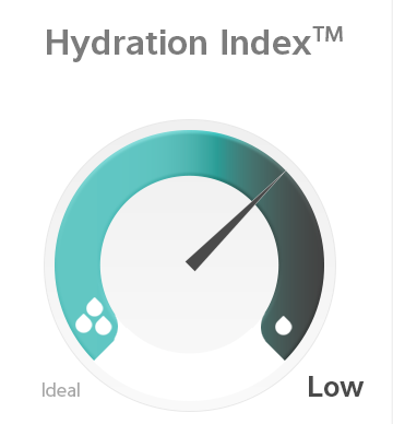
目前,我有以下模型正在运行:
(最新代码请引用fiddle)
    $(function() {

  var chart = new Highcharts.Chart({

    chart: {
      renderTo: 'container',
      type: 'gauge'
    },
    title: {
      text: 'Hydration Index'
    },

    pane: {
      startAngle: -140,
      endAngle: 140,
      size: 200,
      background: {
        backgroundColor: {
          linearGradient: [0, 300, 300, 300],
          stops: [
            [0, 'rgb(152, 230, 230)'],
            [1, 'rgb(0, 0, 10)']
          ]
        },
        innerRadius: '70%',
        outerRadius: '100%',
        shape: 'arc',
      }
    },


    yAxis: {
        reversed: true,
      min: 0,
      max: 100,
      plotBands: [{ // mark the weekend
      }],
      tickInterval: 600
    },


    plotOptions: {

      gauge: {
        dataLabels: {
          enabled: false
        },

        dial: {
          radius: '100%',
          backgroundColor: 'black',
          borderColor: 'white',
          borderWidth: 0.5,
          rearLength: 0,
          baseWidth: 10,
          topWidth: 1,
          baseLength: '0%'
        },
        pivot: {
          radius: 0
        }
      },

    },


    series: [{
      name: 'Hydration percent',
      data: [20],
    }],

    credits: {
      enabled: false
    },
  });

});
1) 如何仅在仪表的一侧添加这些 flex 边缘?
2) 我可以将针的方向从顺时针方向反转为逆时针方向吗?目前,我将 y 轴反转,因此图表按预期方式工作,但它与直觉相反地从高处开始并从那里开始(因此,如果我的图表从 0-100 并且我的数据值为 10,它将开始为 100,默认为 10)。
3)最后,有什么办法可以添加根据结果变化的动态文本吗?
最佳答案
这是可能的,但有点棘手 - 您可以通过修改
Axis.getPlotBandPath方法在渲染器之前修改 SVG 的路径。请参阅下面的演示。您可以简单地禁用初始动画并将值设置为 0。然后,在回调中,将点更新为正确的值:
series: [{
  name: 'Hydration percent',
  animation: false,
  data: [
    0
  ]
}],
和回调:
function(chart) { // on complete
  chart.series[0].points[0].update(80);
  ...
}
使用 Renderer.text 不是问题。例如:
chart.myLabel = chart.renderer.text('Test', 10, 10).add(); // store in some variable然后更新文本:
chart.myLabel.attr({
  text: 'Nice!'
});
这是一个工作演示:http://jsfiddle.net/8p8ab8bg/
关于javascript - Highcharts 仪表样式和添加 CSS 元素,我们在Stack Overflow上找到一个类似的问题: https://stackoverflow.com/questions/38877759/