我想根据平均值或极限值设置 Highcharts 列的颜色。例如,限制值为 %20,超过 %20 的列值将显示为红色,或低于 20% 的列将显示为绿色。
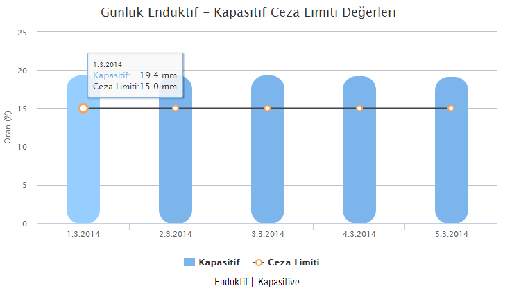
图表显示:

脚本:
function GetEnduktiveKapasitiveValues(type) {

$.ajax({
    url: app_base_url + "Reactive/_ReaktiveDaily",
    type: 'POST',
    data: { branchId: 9, dateMonth: 3, type: type },
    success: function (result) {
        var list = [];
        $.each(result.DateList, function (i, val) {
            var value = new Date(parseInt(val.substr(6)));
            var month = value.getMonth() + 1;
            var ret = value.getDate() + "." + month + "." + value.getFullYear();
            list[i] = ret;
        });
        $('#container').highcharts({
            chart: {
                type: 'column'
            },
            title: {
                text: 'Günlük Endüktif - Kapasitif Ceza Limiti Değerleri'
            },
            subtitle: {
                text: ''
            },
            xAxis: {
                categories: list
            },
            yAxis: {
                min: 0,
                title: {
                    text: 'Oran (%)'
                }
            },

            tooltip: {
                headerFormat: '<span style="font-size:10px">{point.key}</span><table>',
                pointFormat: '<tr><td style="color:{series.color};padding:0">{series.name}: </td>' +
                    '<td style="padding:0"><b>{point.y:.1f} mm</b></td></tr>',
                footerFormat: '</table>',
                shared: true,
                useHTML: true
            },
            credits: {
                enabled: false
            },
            plotOptions: {
                column: {
                    pointPadding: 0.2,
                    borderWidth: 0,
                    borderRadius: 20
                },
                color : ['#333', '#CB2326', '#DDDF00', '#24CBE5', '#64E572', '#FF9655', '#CB2326',      '#6AF9C4']
            },
            series: [{
                name: result.Name,
                data: result.RateList,
                type: 'column'

            }, {
                name: 'Ceza Limiti',
                type: 'line',
                data: result.Average,
                marker: {
                    lineWidth: 2,
                    lineColor: Highcharts.getOptions().colors[3],
                    fillColor: 'white'
                }
            }]
        });
    },
    error: function (result) { }
});
}
我想得到这样的结果:

最佳答案
- 制作一个临时系列对象。
- 然后遍历您的数据并根据您的值分配
data.color并将其推送到系列数据对象。 - 循环结束后,将临时系列对象推送到 Highcharts 选项系列。
示例是一个简单的演示。您需要根据自己的需要对其进行调整。
关于javascript - 如何动态更改 Highchart 列颜色,我们在Stack Overflow上找到一个类似的问题: https://stackoverflow.com/questions/25623811/