我想要一个显示几个节点的图表,节点之间的方向箭头代表一种关系,粗细与其连接强度相关。
在 R 中这很简单
library("qgraph")
test_edges <- data.frame(
   from = c('a', 'a', 'a', 'b', 'b'),
   to = c('a', 'b', 'c', 'a', 'c'),
   thickness = c(1,5,2,2,1))
qgraph(test_edges, esize=10, gray=TRUE)
产生:
但是在 Python 中我一直没能找到一个明确的例子。 NetworkX 和 igraph 似乎暗示这是可能的,但我一直没弄明白。
最佳答案
我首先尝试使用 NetworkX 的标准绘图函数来执行此操作,该函数使用 matplotlib,但我不是很成功。
但是,NetworkX 也 supports drawing to the dot format ,这supports edge weight, as the penwidth attribute .
解决方法如下:
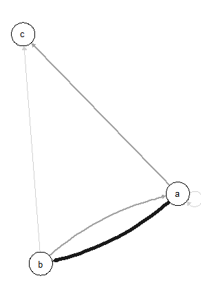
import networkx as nx

G = nx.DiGraph()
edges = [
    ('a', 'a', 1),
    ('a', 'b', 5),
    ('a', 'c', 2),
    ('b', 'a', 2),
    ('b', 'c', 1),
    ]
for (u, v, w) in edges:
    G.add_edge(u, v, penwidth=w)

nx.nx_pydot.write_dot(G, '/tmp/graph.dot')
然后,要显示图形,请在终端中运行:
dot -Tpng /tmp/graph.dot > /tmp/graph.png
xdg-open /tmp/graph.png
(或您操作系统上的等效项)
显示:

关于python - 如何在 python 中制作力导向图?,我们在Stack Overflow上找到一个类似的问题: https://stackoverflow.com/questions/38927682/