我正在尝试用颜色条绘制圆图,几乎像这样:
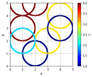
但是目前颜色条的最小值是1;我希望能够将其设置为 0。
import pandas            as pd
import matplotlib.pyplot as plt
import matplotlib.cm     as cm
from sklearn import preprocessing

df = pd.DataFrame({'A':[1,2,1,2,3,4,2,1,4],
                   'B':[3,1,5,1,2,4,5,2,3],
                   'C':[4,2,4,1,3,3,4,2,1]})

# set the Colour
x              = df.values
min_max_scaler = preprocessing.MinMaxScaler()
x_scaled       = min_max_scaler.fit_transform(x)
df_S           = pd.DataFrame(x_scaled)
c1             = df['C']
c2             = df_S[2]
colors         = [cm.jet(color) for color in c2]

# Graph
plt.figure()
ax = plt.gca()
for a, b, color in zip(df['A'], df['B'], colors):
    circle = plt.Circle((a,
                         b),
                         1, # Size
                         color=color,
                         lw=5,
                         fill=False)
    ax.add_artist(circle)

plt.xlim([0,5])
plt.ylim([0,5])
plt.xlabel('A')
plt.ylabel('B')
ax.set_aspect(1.0)

sc = plt.scatter(df['A'],
                 df['B'],
                 s=0,
                 c=c1,
                 cmap='jet',
                 facecolors='none')
plt.grid()

cbar = plt.colorbar(sc)
cbar.set_label('C', rotation=270, labelpad=10)

plt.show()
归功于这个原始问题: Plotting circles with no fill, colour & size depending on variables using scatter
最佳答案
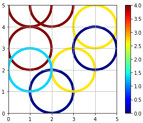
只需在 plt.scatter() 中添加 vmin 和 vmax 参数。
sc = plt.scatter(df['A'],
                 df['B'],
                 s=0,
                 c=c1,
                 cmap='jet',
                 vmin = 0,
                 vmax = 4,
                 facecolors='none')
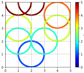
如果您想根据颜色图调整圆圈的颜色,则需要使用 `Normalize(vmin, vmax) 并将颜色图传递给具有归一化值的圆图。
代码如下:
import pandas            as pd
import matplotlib.pyplot as plt
import matplotlib.cm     as cm
from sklearn import preprocessing
from matplotlib.colors import Normalize

df = pd.DataFrame({'A':[1,2,1,2,3,4,2,1,4],
                   'B':[3,1,5,1,2,4,5,2,3],
                   'C':[4,2,4,1,3,3,4,2,1]})

# set the Colour
x              = df.values
min_max_scaler = preprocessing.MinMaxScaler()
x_scaled       = min_max_scaler.fit_transform(x)
df_S           = pd.DataFrame(x_scaled)
c1             = df['C']
c2             = df_S[2]
cmap = cm.jet
vmin = 0
vmax = 5 #your max Y is 5, not 4
norm = Normalize(vmin, vmax)

# Graph
plt.figure()
ax = plt.gca()
for a, b in zip(df['A'], df['B']):
    circle = plt.Circle((a,
                         b),
                         1, # Size
                         color=cmap(norm(b)),
                         lw=5,
                         fill=False)
    ax.add_artist(circle)

plt.xlim([0,5])
plt.ylim([0,5])
plt.xlabel('A')
plt.ylabel('B')
ax.set_aspect(1.0)

sc = plt.scatter(df['A'],
                 df['B'],
                 s=0,
                 c=c1,
                 cmap='jet',
                 vmin = vmin,
                 vmax = vmax,
                 facecolors='none')
plt.grid()

cbar = plt.colorbar(sc)
cbar.set_label('C', rotation=270, labelpad=10)

plt.show()
关于python - 带颜色条的圆图,我们在Stack Overflow上找到一个类似的问题: https://stackoverflow.com/questions/51020192/