我在 matplotlib 中使用散点图来绘制一些点。我有两个一维数组,每个数组存储样本的 x 和 y 坐标。还有另一个存储标签的一维数组(以决定应该以哪种颜色绘制点)。到目前为止我编程:
import matplotlib.pyplot as plt
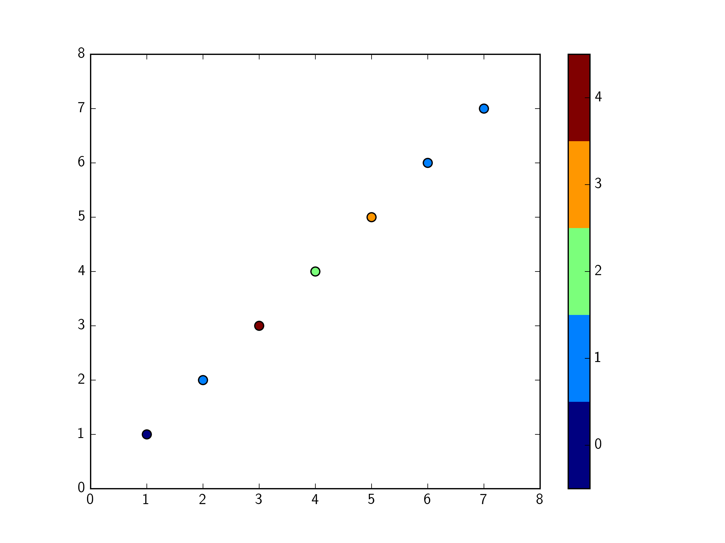
X = [1,2,3,4,5,6,7]
Y = [1,2,3,4,5,6,7]
label = [0,1,4,2,3,1,1]
plt.scatter(X, Y, c= label, s=50)
plt.show()
现在我希望能够看到哪种颜色对应于哪个标签? 我在 matplotlib 中查找了图例的实现,就像这里的一样: how to add legend for scatter()? 但是他们建议为样本的每个标签创建一个图。但是我所有的标签都在同一个一维数组(标签)中。我怎样才能做到这一点?
最佳答案
您可以使用颜色图来完成。如何做到这一点的一些例子是 here .
import matplotlib.pyplot as plt
import numpy as np
import matplotlib.colors as colors
X = [1,2,3,4,5,6,7]
Y = [1,2,3,4,5,6,7]
label = [0,1,4,2,3,1,1]

# Define a colormap with the right number of colors
cmap = plt.cm.get_cmap('jet',max(label)-min(label)+1)

bounds = range(min(label),max(label)+2)
norm = colors.BoundaryNorm(bounds, cmap.N)

plt.scatter(X, Y, c= label, s=50, cmap=cmap, norm=norm)

# Add a colorbar. Move the ticks up by 0.5, so they are centred on the colour.
cb=plt.colorbar(ticks=np.array(label)+0.5)
cb.set_ticklabels(label)

plt.show()
您可能需要尝试让刻度标签以其颜色为中心,但您明白了。
关于python - 使用 matplotlib 中样本的标签为散点图创建图例,我们在Stack Overflow上找到一个类似的问题: https://stackoverflow.com/questions/30505407/