问题是我想要连续三个 div 而不是六个,我设置了 width整个部分的 80% 和 width每个部分的 26,66667% 这是 80/3 但我的 display: flex无法正常工作
这是我的代码:
body,
html {
  background: #FFFFFF;
  margin: 0;
  padding: 0;
  height: 100%;
}
* {
  box-sizing: border-box;
}
#section_wrapper {
  width: 80%;
  margin: 0 auto;
  position: relative;
  font-size: 0;
  display: flex;
}
.section {
  margin: 0;
  padding: 0;
  position: relative;
  width: 26.666667%;
  height: 200px;
  font-size: 20px;
}
.section1 {
  background: url(http://dreamatico.com/data_images/mountain/mountain-1.jpg);
  background-position: center;
}
.section2 {
  background: url(http://dreamatico.com/data_images/mountain/mountain-1.jpg);
  background-position: center;
}
.section3 {
  background: url(http://dreamatico.com/data_images/mountain/mountain-1.jpg);
  background-position: center;
}
.section4 {
  background: url(http://dreamatico.com/data_images/mountain/mountain-1.jpg);
  background-position: center;
}
.section5 {
  background: url(http://dreamatico.com/data_images/mountain/mountain-1.jpg);
  background-position: center;
}
.section6 {
  background: url(http://dreamatico.com/data_images/mountain/mountain-1.jpg);
  background-position: center;
}
.section1 h3 {
  font-family: "Roboto";
  color: white;
  top: 50%;
  left: 50%;
  margin: 0;
  padding: 0;
  position: absolute;
  transform: translate(-50%, -50%);
}
.section3 h3 {
  font-family: "Roboto";
  color: white;
  top: 50%;
  left: 50%;
  margin: 0;
  padding: 0;
  position: absolute;
  transform: translate(-50%, -50%);
}
.section5 h3 {
  font-family: "Roboto";
  color: white;
  top: 50%;
  left: 50%;
  margin: 0;
  padding: 0;
  position: absolute;
  transform: translate(-50%, -50%);
}
<div id="section_wrapper">
<div class="section section1">
<h3>About me</h3>
</div>
<div class="section section3">
</div>
<div class="section section3">
<h3>Work</h3>
</div>
<div class="section section4">
</div>
<div class="section section5">
<h3>Services</h3>
</div>
<div class="section section6">
</div>
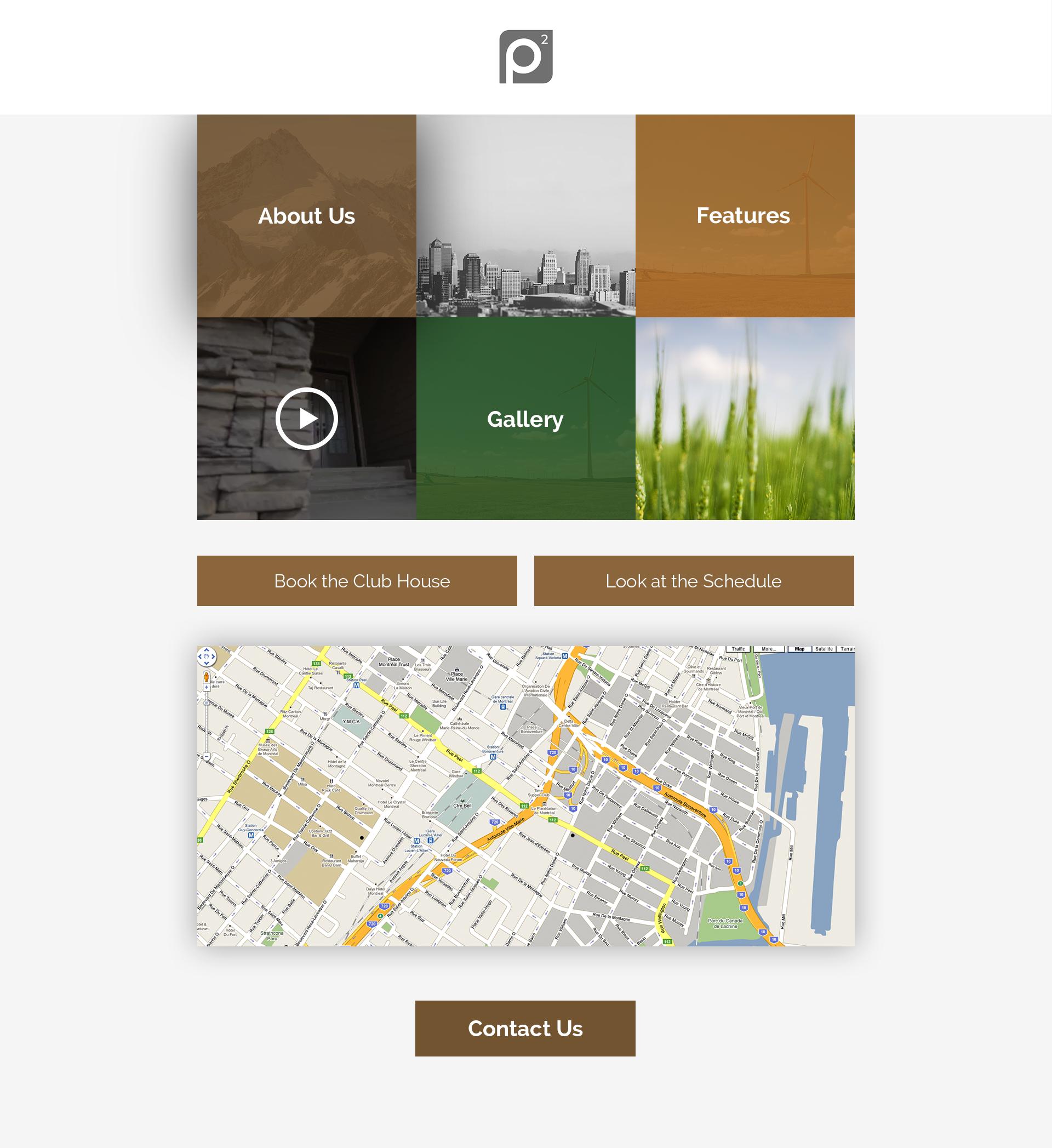
</div>顺便说一句,这是我正在尝试编码的设计:
最佳答案
您缺少 flex-wrap:wrap 使用它会在没有更多空间供子级扩展时换行
你可以使用flex-basis: calc(100%/3)代替那个奇怪的width
查看一篇关于flexbox的好文章here
body,
html {
  background: #FFFFFF;
  margin: 0;
  padding: 0;
  height: 100%;
}
* {
  box-sizing: border-box;
}
#section_wrapper {
  width: 80%;
  margin: 0 auto;
  position: relative;
  font-size: 0;
  display: flex;
  flex-wrap: wrap
}
.section {
  margin: 0;
  padding: 0;
  position: relative;
  flex: 1 calc(100%/3);
  height: 200px;
  font-size: 20px;
}
.section1 {
  background: url(http://dreamatico.com/data_images/mountain/mountain-1.jpg);
  background-position: center;
}
.section2 {
  background: url(http://dreamatico.com/data_images/mountain/mountain-1.jpg);
  background-position: center;
}
.section3 {
  background: url(http://dreamatico.com/data_images/mountain/mountain-1.jpg);
  background-position: center;
}
.section4 {
  background: url(http://dreamatico.com/data_images/mountain/mountain-1.jpg);
  background-position: center;
}
.section5 {
  background: url(http://dreamatico.com/data_images/mountain/mountain-1.jpg);
  background-position: center;
}
.section6 {
  background: url(http://dreamatico.com/data_images/mountain/mountain-1.jpg);
  background-position: center;
}
.section1 h3 {
  font-family: "Roboto";
  color: white;
  top: 50%;
  left: 50%;
  margin: 0;
  padding: 0;
  position: absolute;
  transform: translate(-50%, -50%);
}
.section3 h3 {
  font-family: "Roboto";
  color: white;
  top: 50%;
  left: 50%;
  margin: 0;
  padding: 0;
  position: absolute;
  transform: translate(-50%, -50%);
}
.section5 h3 {
  font-family: "Roboto";
  color: white;
  top: 50%;
  left: 50%;
  margin: 0;
  padding: 0;
  position: absolute;
  transform: translate(-50%, -50%);
}
<div id="section_wrapper">
<div class="section section1">
<h3>About me</h3>
</div>
<div class="section section3">
</div>
<div class="section section3">
<h3>Work</h3>
</div>
<div class="section section4">
</div>
<div class="section section5">
<h3>Services</h3>
</div>
<div class="section section6">
</div>
</div>关于html - 我的 Flex 在行中显示六个 div,而不是三个?,我们在Stack Overflow上找到一个类似的问题: https://stackoverflow.com/questions/38357895/