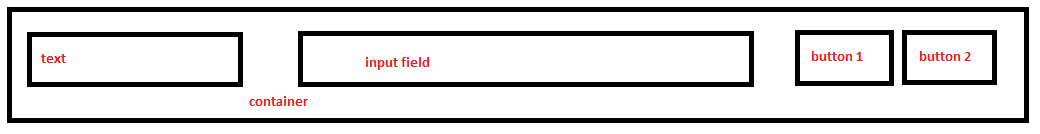
我试图将四个元素并排放置在容器 div 内;它们的宽度都不同。
这是我想要的结果:
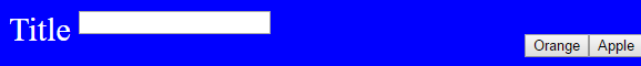
不幸的是,这就是目前的情况:
.container {
  width: 100%;
  background: blue;
  padding: 10px;
}
p {
  margin: 0px;
  color: #fff;
  font-size: 30px;
  width: 11%;
  float: left;
}
button {
  float: right;
}
<div class="container">
<p>Title</p>
<form>
<input type="text" class="input">
</form>
<button>Apple</button>
<button>Orange</button>
<div style="clear: both;"></div>
</div>JsFiddle:https://jsfiddle.net/uLL708jg/
Flex 可以用于此吗?如果是这样,有人可以告诉我答案吗?
最佳答案
是的,flexbox 可以解决这个问题。这只是一个基本设置。在 .container 上,放置 display: flex; 并删除所有 float 。然后将按钮包装在 div 中(此处为 .right),并为其指定 margin-left: auto; 以将其停放在屏幕右侧。
编辑
justify-content: space- Between; 将对齐三个元素,以便元素之间有空间,因此搜索将位于 div .container 的中间>。不再需要 margin-left: auto;,尽管需要它周围的 div 包装器。了解有关 Flexbox 及其使用方法的更多信息 at MDN .
.container {
  display: flex;
  width: 100%;
  background: blue;
  padding: 10px;
  flex-flow: row wrap;
  align-items: center;
  justify-content: space-between;
}

p {
  margin: 0px;
  color: #fff;
  font-size: 30px;
  width: 11%;
}
<div class="container">
<p>Title</p>
<form>
<input type="text" class="input">
</form>
<div class="right">
<button>Apple</button>
<button>Orange</button>
</div>
</div>关于html - 将四个元素相邻放置在 div 内,宽度不同,我们在Stack Overflow上找到一个类似的问题: https://stackoverflow.com/questions/41648853/