这是我第一次构建一个具有 CSS 布局的完全可扩展的应用程序,当用户调整窗口大小时,字段应该相应地缩小和增长。首先我想,很容易,对吧?但现在我真的对尺寸摸不着头脑,因为看起来边距不太正确...我想在所有单独的字段之间有一个类似边框的分隔符...
我的代码是这样的:
<div style='background-color:#000000;width:100%;height:100%;'>

    <div style='width:100%;height:66%;margin-bottom:1%;'>

        <div style='float:left; width:19%;height:100%;margin-right:1%;' class='app_14_concept_block'>keypartners</div>
        <div style='float:left; width:19%;height:100%;margin-right:1%;'>

            <div style='height:49%;margin-bottom:6%' class='app_14_concept_block'>key activities</div>

            <div style='height:49%;' class='app_14_concept_block'>key resources</div>

        </div>
        <div style='float:left; width:19%; height:100%;margin-right:1%;' class='app_14_concept_block'>value propositions</div>
        <div style='float:left; width:19%; height:100%;margin-right:1%;'>

            <div style='height:49%;margin-bottom:6%'  class='app_14_concept_block'>customer relationship</div>

            <div style='height:49%;' class='app_14_concept_block'>channels</div>

        </div>
        <div style='float:left; width:19%; height:100%;padding-right:1%' class='app_14_concept_block'>customer segments</div>
    </div>
    <div style='width:100%;height:33%;'>
        <div style='float:left; width:49%; height:100%;margin-right:1%;' class='app_14_concept_block'>cost</div>
        <div style='float:left; width:50%; height:100%;' class='app_14_concept_block'>revenue</div>
    </div>

</div>
CSS是这样的:
.app_14_concept_block{
  background-color:#ffffff;
}
.app_14_concept_block:hover{
background-color:#eeeeee;
}
这就是它现在的样子(蓝色的东西是我的应用程序查看器布局的一部分,可以打开评论)-我主要关心的是右侧添加的空白(黑色)空间,在末尾行:
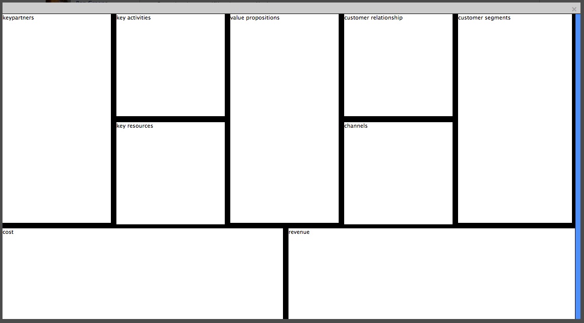
jsfiddle在这里:http://jsfiddle.net/gbMZy/51/
我还尝试将“客户分割”宽度设置为 20% - 遗憾的是没有效果:
截图: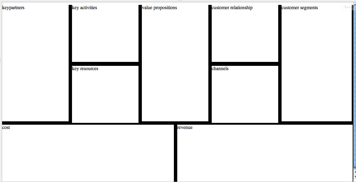
jsfiddle:http://jsfiddle.net/gbMZy/52/
最佳答案
也许这个解决方案 Footer Items Expanding with Viewport Evenly也可以适用于您的情况。
百分比宽度与边框或边距不能很好地配合。 一种可能的解决方法是使用具有完整 20%/50% 宽度的包装容器,然后在其中内部使用带有边框等的元素。这应该有助于避免闪烁和随机间距。
因此,在您的情况下,这可能类似于: http://jsfiddle.net/qC4JV/1/
HTML:
<div class="top">
<div class="cell">
<div class="border right"></div>
<div class="border bottom"></div>
<p>value</p>
</div>
<div class="cell">
<div class="border right"></div>
<div class="border bottom"></div>
<p>value</p>
</div>
<div class="cell">
<div class="border right"></div>
<div class="border bottom"></div>
<p>value</p>
</div>
<div class="cell">
<div class="border right"></div>
<div class="border bottom"></div>
<p>value</p>
</div>
<div class="cell">
<div class="border bottom"></div>
<p>value</p>
</div>
</div>
<div class="bottom">
<div class="cell">
<div class="border right"></div>
<p>value</p>
</div>
<div class="cell">
<p>value</p>
</div>
</div>
CSS:
body, html{
    height: 100%;
    background: #000;
}

.top{
    height: 60%;
}

.bottom{
    height: 40%;
}

.cell{
    float: left;
    height: 100%;
    background: #fff;
    position: relative;
}

.cell .border.right{
  position: absolute;
  right: 0;
  top: 0;
  width: 10px;
  height: 100%;
  background: #000;
}

.cell .border.bottom{
  position: absolute;
  left: 0;
  bottom: 0;
  width: 100%;
  height: 10px;
  background: #000;
}

.top .cell{
  width: 20%;
}

.bottom .cell{
  width: 50%;
}
关于css - 对网络应用程序尺寸的百分比感到困惑,我们在Stack Overflow上找到一个类似的问题: https://stackoverflow.com/questions/11148624/