我在 div 底部添加图像边框,如下所示:
HTML:
<div class="view">
    <div class="shadow_overlay"></div>
</div>
CSS:
.view {
    text-align: center;
    overflow: hidden;
    position: relative;
    text-align: center;
    cursor: default;
    width: 160px;
    height: 190px;
    border-image: linear-gradient(to right, rgb(139, 191, 64) 25%, rgb(230, 27, 33) 25%, rgb(230, 27, 33) 50%, rgb(124, 196, 236) 50%, rgb(124, 196, 236) 75%, rgb(254, 181, 17) 75%);
    border-image-slice: 1;
    border-image-width: 4px 0px 0px 0px;
}
.shadow_overlay {
    background: url('http://i.imgur.com/MrVzqyp.png') 0 0 no-repeat;
    background-size: cover;
    position: absolute;
    top: 0;
    right: 0;
    bottom: 0;
    left: 0;
    margin-left:auto;
    margin-right:auto;
    width:160px;
    height:190px;
}
这有效,但实际上 border-image 比我的 div 宽。
问题图片:
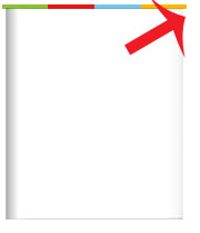
如何解决这个问题?
演示 here
最佳答案
当 border-image 时,浏览器似乎为边框分配了默认宽度。使用(但另一侧的边框不可见,因为 border-image-width 是 0px )。为了避免边框看起来溢出 div ,手动将所有其他边的边框宽度设置为 0px。
border-width: 4px 0px 0px 0px;
此行为出现在 Chrome(最高 v48.0.2535.0 dev-m)、IE (Edge)、Opera 和 Safari 中。边框图像不会超出 div在最新的 Firefox (v41.0.1) IE (v11) 中,
.view {
  text-align: center;
  overflow: hidden;
  position: relative;
  text-align: center;
  cursor: default;
  width: 160px;
  height: 190px;
  border-image: linear-gradient(to right, rgb(139, 191, 64) 25%, rgb(230, 27, 33) 25%, rgb(230, 27, 33) 50%, rgb(124, 196, 236) 50%, rgb(124, 196, 236) 75%, rgb(254, 181, 17) 75%);
  border-image-slice: 1;
  border-image-width: 4px 0px 0px 0px;
  border-width: 4px 0px 0px 0px;
}
.shadow_overlay {
  background: url('http://i.imgur.com/MrVzqyp.png') 0 0 no-repeat;
  background-size: cover;
  position: absolute;
  top: 0;
  right: 0;
  bottom: 0;
  left: 0;
  margin-left: auto;
  margin-right: auto;
  width: 160px;
  height: 190px;
}
<div class="view">
<div class="shadow_overlay"></div>
</div>在下面的代码片段中,您可以看到它看起来好像所有其他边都有 3px 边框。网络或规范中都没有明确解释谁的行为是正确的(Chrome、Edge 或 FF、IE11)。
.view {
  text-align: center;
  overflow: hidden;
  position: relative;
  text-align: center;
  cursor: default;
  width: 160px;
  height: 190px;
  border-image: linear-gradient(to right, rgb(139, 191, 64) 25%, rgb(230, 27, 33) 25%, rgb(230, 27, 33) 50%, rgb(124, 196, 236) 50%, rgb(124, 196, 236) 75%, rgb(254, 181, 17) 75%);
  border-image-slice: 1;
  border-image-width: 4px 0px 0px 0px;
  }
.view#two{
  border-width: 4px 3px 3px 3px;
}
.shadow_overlay {
  background: url('http://i.imgur.com/MrVzqyp.png') 0 0 no-repeat;
  background-size: cover;
  position: absolute;
  top: 0;
  right: 0;
  bottom: 0;
  left: 0;
  margin-left: auto;
  margin-right: auto;
  width: 160px;
  height: 190px;
}
<div class="view">
<div class="shadow_overlay"></div>
</div>
<div class="view" id="two">
<div class="shadow_overlay"></div>
</div>W3C 规范还对边框图像属性做了如下规定,但在 FF 和 IE11 中为 border-image仅当 border-width 时不显示提供并且 border-image-width避免了。
The border-image properties do not affect layout: layout of the box, its content, and surrounding content is based on the ‘border-width’ and ‘border-style’ properties only.
所以,这看起来像 border-image 的行为仍然没有标准化。我倾向于在 Chrome、Edge 中观察到的情况,因为 Microsoft 出于某种原因似乎已经改变了 IE11 的行为,因此一定有充分的理由。
关于html - CSS 边框图像比 div 宽,我们在Stack Overflow上找到一个类似的问题: https://stackoverflow.com/questions/33452349/