我一直在努力将图标放置在具有 border-radius: 50% 属性的图像的右下角。 这是我想要实现的(图标在圆周上),

通过绝对和相对定位,我可以按预期放置图标,但在较小的屏幕上,由于图像大小调整(使用 Bootstrap 4 的 img-fluid 类),图标不在适当的位置。
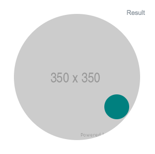
即使在调整图像大小后,如何使图标在所有屏幕上都位于同一位置?
.wrapper{
  position: relative;
  display: inline-block;
  margin: 30px;
}

.image{
  border-radius: 50%;
}

.icon{
  height: 50px;
  width: 50px;
  background: #008080;
  position: absolute;
  border-radius: 50%;
  right: 22px;
  bottom: 42px;
}
<link href="https://maxcdn.bootstrapcdn.com/bootstrap/4.0.0/css/bootstrap.min.css" rel="stylesheet"/>
<div class='wrapper'>
<img src='https://via.placeholder.com/350x350' class='image img-fluid'/>
<span class='icon'></span>
</div>最佳答案
为了获得所需的结果,您需要将小圆(尺寸为 0px × 0px)的中心定位在所需的高度/宽度处较大的一个,然后围绕这个中心画一个小圆圈。
请注意,如果您希望以响应方式完成定位,则需要以百分比而不是 px 为单位。
由于子元素所需的功能纯粹是视觉的,您可以安全地使用伪元素:
.icon {
   width: 0px;
   height: 0px;
   position: absolute;
}
.icon:after {
   width: 50px;
   height: 50px;
}
就居中而言,您有两种选择:
a) transform:translate(-50%,-50%)
.wrapper {
  position: relative;
  display: inline-block;
  margin: 30px;
}

.image {
  border-radius: 50%;
}

.icon {
  height: 0;
  width: 0;
  position: absolute;
  right: 16%;
  bottom: 13.5%;
  overflow: visible;
}

.icon:before {
  height: 50px;
  width: 50px;
  position: absolute;
  border-radius: 50%;
  content: '';
  transform: translate(-50%, -50%);
  background-color: #008080;
  display: block;
}
<link href="https://maxcdn.bootstrapcdn.com/bootstrap/4.0.0/css/bootstrap.min.css" rel="stylesheet" />
<div class='wrapper'>
<img src='https://via.placeholder.com/350x350' class='image img-fluid' />
<span class='icon'></span>
</div>b) 父级上的 flexbox:
.wrapper {
  position: relative;
  display: inline-block;
  margin: 30px;
}

.image {
  border-radius: 50%;
}

.icon {
  height: 0;
    width: 0;
    position: absolute;
    right: 16%;
    bottom: 13.5%;
    display: flex;
    overflow: visible;
    align-items: center;
    justify-content: center;
}

.icon:before {
  height: 50px;
  width: 50px;
  border-radius: 50%;
  position: absolute;
  content: '';
  background-color: #008080;
  display: block;
}
<link href="https://maxcdn.bootstrapcdn.com/bootstrap/4.0.0/css/bootstrap.min.css" rel="stylesheet" />
<div class='wrapper'>
<img src='https://via.placeholder.com/350x350' class='image img-fluid' />
<span class='icon'></span>
</div>要在大圆圈上旋转小圆圈,您可以用数学方法完成,也可以像我一样做:我制作了 :after 3px × 3px ,将 top|bottom + left|right 的任何组合的 % 更改为较大中心圆周上的所需位置并增加小中心的大小回到 50px * 50px。
此外,为了相应地缩小较小的圆圈,您可以在特定视口(viewport)宽度下在 vw 中表示宽度和高度,确保在它开始缩小尺寸时在 中px 与 vw 中的那个转换为相同的实际大小。示例:
.wrapper {
  position: relative;
  display: inline-block;
  margin: 30px;
}

.image {
  border-radius: 50%;
}

.icon {
  height: 0;
    width: 0;
    position: absolute;
    right: 16%;
    bottom: 13.5%;
    display: flex;
    overflow: visible;
    align-items: center;
    justify-content: center;
}

.icon:before {
  height: 35px;
  width: 35px;
  border-radius: 50%;
  position: absolute;
  content: '';
  background-color: #008080;
  display: block;
}
@media (max-width: 350px) {
  .icon:before {
    width: calc(10vw - 6px);
    height: calc(10vw - 6px);
    min-width: 5px;
    min-height: 5px;
    /* 60px making up for the padding on .wrapper */
  }

}
<link href="https://maxcdn.bootstrapcdn.com/bootstrap/4.0.0/css/bootstrap.min.css" rel="stylesheet" />
<div class='wrapper'>
<img src='https://via.placeholder.com/350x350' class='image img-fluid' />
<span class='icon'></span>
</div>关于html - 将元素绝对定位在圆的圆周上,我们在Stack Overflow上找到一个类似的问题: https://stackoverflow.com/questions/52191229/