我有以下用于简单模板的简单 html 代码:
<!DOCTYPE html>
<html>
<head>
<title>My new website</title>
<meta name="description" content="Simple website styled using flex box layout">
<meta http-equiv="refresh" content="60">
<link rel="stylesheet" type="text/css" href="style1.css">
</head>
<body>
<div class="mainContainer">
<nav class="mainMenu">
<ol>
<li>
<a href="#">Home</a>
</li>
<li>
<a href="#">About</a>
</li>
<li>
<a href="#">Contact Us</a>
</li>
</ol>
</nav>
<div class="mainArea">
<aside class="leftBar">
<h3>Navigation side bar</h3>
<p>Still need to think better what I will implement here.</p>
</aside>
<article class="mainContent">
<h1>Welcome!</h1>
<p>Nice to meet you...</p>
</article>
<aside class="rightBar">
<h3>News</h3>
<p>No news for now.</p>
</aside>
</div>
<footer class="mainFooter">
<p>Copyright ©
<a href="mailto:someone@coldmail.com"> someone</a>
</p>
</footer>
</div>
</body>
</html>
但在我添加 <!DOCTYPE html> 后布局中断了在html代码的开头。现在看起来像这样:
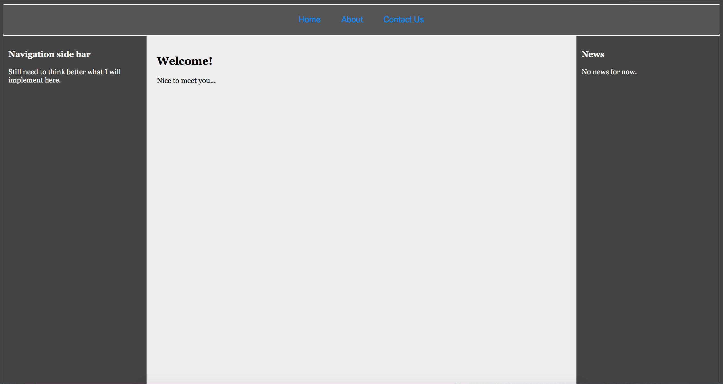
但它应该是这样的:
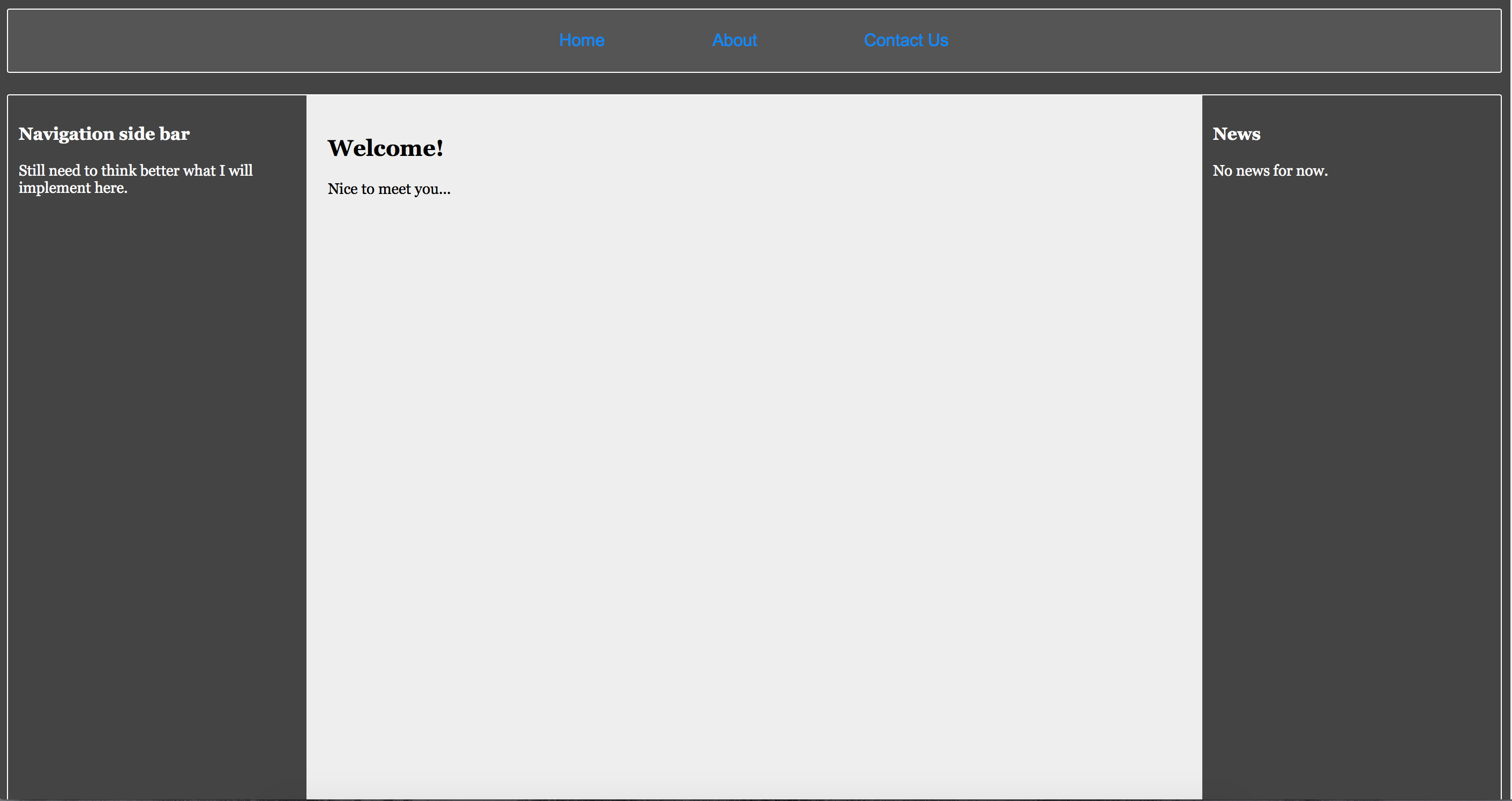
不仅边距坏了,例如导航栏也不完全是它应该的样子。我四处寻找解决方案,并且有一些相关的问题,但我根本不明白为什么会出现这个问题。
这里有 CSS 代码:
html, body{
    height: 100%;
    width:auto;
    font: 14px Arial;
    color:white;
    background: #444;
}

/* links */
a{
    text-decoration: none;
    color: #00aefb;
}

a:visited{
    color:#008efb;
}

a:hover{
    color: #999;
}

/* flex elements */

.mainContainer, .mainFooter, .mainArea, .mainMenu, .mainMenu ol{
    display: flex;
    display: -webkit-flex;
    display: -moz-flex;
}


/* Main container */
.mainContainer{
    font-family: Georgia;
    flex-direction: column;
    -webkit-flex-direction: column;
    -moz-flex-direction: column;
}

/* mainMenu and footer */
.mainMenu, .mainFooter{
    background: #555;
    border: 1px solid white;
    border-radius: 2px;
    padding: 10px;
}

/* Just footer */
.mainFooter {
    text-align: center;
    font: 15px Arial;
    min-height: 60px;

    justify-content: center;
    -webkit-justify-content: center;
    -moz-justify-content: center;

    align-items: center;
    -webkit-align-items: center;
    -moz-align-items: center;
}

/* Main area of contents */
.mainArea{
    color: white;
    border: 1px solid white;
    border-radius: 2px;
    margin: 20 0 20 0;
    min-height:800px;
}

/* Main area of the main area */
.mainContent{
    background: #eee;
    color: black;
    padding:20px;

    flex: 2 2 50%;
    -webkit-flex: 2 2 50%;
    -moz-flex: 2 2 50%;
}

/* Left and right side bars */
.leftBar, .rightBar{
    padding: 10px;

    flex: 1 1 15%;
    -webkit-flex: 1 1 15%;
    -moz-flex: 1 1 15%;
}

/* mainMenu bar at the top */
.mainMenu {
    font: 16px Arial;

    justify-content: center;
    -webkit-justify-content: center;
    -moz-justify-content: center;

    padding: 0;
}

.mainMenu ol {
    list-style: none;
    padding: 0; /* Removes annoying indentation */
    margin: 0;
    text-align: center;
}

.mainMenu ol li{
    display: inline;
    padding: 20px;
    margin: 0 30 0 30;
}

li:hover, li.active{
    background: #222;
    color: #999;
    border-radius: 5px;
}


@media all and(max-width: 640px){
    .mainArea{
        flex-direction: column;
        -webkit-flex-direction: column;
        -moz-flex-direction: column;
    }

    .mainMenu {
        font: 18px Arial;

        flex-direction: column;
        -webkit-flex-direction: column;
        -moz-flex-direction: column;
    }

    .mainMenu ol {
        flex-direction: column;
        -webkit-flex-direction: column;
        -moz-flex-direction: column;

        align-items:stretch;
        -webkit-align-items:stretch;
        -moz-align-items:stretch;
    }

    .mainMenu ol li {
        margin: 0;
        padding: 10px;
    }

    .mainContainer .mainArea {
        border: 0;
        border-radius: 0;
    }

    .mainContent{
        order: -1;
        -webkit-order: -1;
        -moz-order: -1;

        margin: 0 0 20 0;
        border: 1px solid white;
        border-radius: 2px;
    }

    .leftBar {
        margin: 0 0 20 0;
        border: 1px solid white;
        border-radius: 2px;
    }

    .rightBar{
        border: 1px solid white;
        border-radius: 2px;
    }

}
最佳答案
我不会说添加 <!DOCTYPE html>打破布局。 doctype 告诉浏览器如何解释 HTML 和 CSS,如果不指定,则浏览器进入 quirk 模式,显示不同于严格模式。
通过添加 <!doctype html> ,您的某些 CSS 样式会变得不正确,并且浏览器确实会以最佳方式解释它们。例如,您遇到的问题之一是存在一些未指定单位的非零数值(例如:margin: 20 0 20 0;)。
关于css - <!DOCTYPE html> 分解布局,我们在Stack Overflow上找到一个类似的问题: https://stackoverflow.com/questions/30277178/