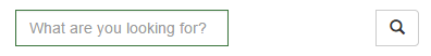
如何更改 .input-group 的宽度以使其更宽?我尝试设置 width: 50% 但这会在输入字段和按钮之间放置一个空格。

我也试过直接设置输入框的宽度,但也失败了。
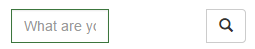
并将其设置为超过 100%,这也失败了。
如果我将宽度设置为 300px 或 400px 看起来不错,但在移动设备上不行。
这是一个 Bootply http://www.bootply.com/HGr9b06Q1B
最佳答案
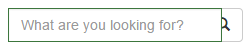
您需要将其包装在 Bootstrap 结构中...例如:
<div class="container">
  <div class="row">
    <div class="col-sm-4 col-sm-offset-4"><!--width is set by this div -->

      <div class="input-group">
        <input type="text" class="form-control" placeholder="Search for...">
        <span class="input-group-btn">
          <button class="btn btn-default" type="button"><span class="glyphicon glyphicon-search"></span></button>
        </span>
      </div><!-- /input-group -->

    </div>
  </div>
</div>
哦,尽量不要使用 <center>元素,它已被弃用。
关于html - 如何响应地更改 Bootstrap 中 .input-group 的宽度?,我们在Stack Overflow上找到一个类似的问题: https://stackoverflow.com/questions/29568914/