我正在尝试创建一个带有嵌套容器的简单 flexbox 布局。
当我只有一个容器并使用全宽 + 高时,效果很好。
问题是嵌套容器也使用 display: flex,不知何故嵌套容器不使用所有剩余空间(只有当它们具有定义的宽度/高度时才有效)。
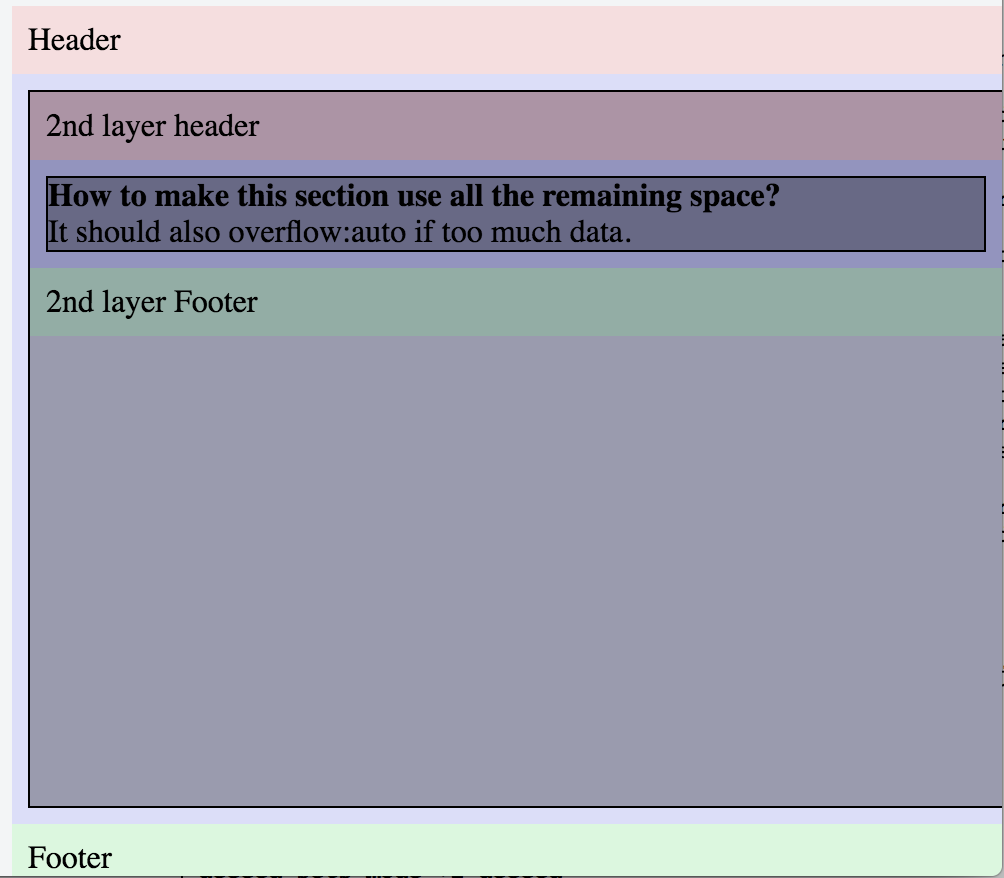
<div class="flexbox-parent">
<div class="flexbox-item header">
    Header
</div>

<div class="flexbox-item fill-area content flexbox-item-grow">
    <div class="fill-area-content flexbox-item-grow">
        <div class="flexbox-parent">
            <div class="flexbox-item header">
                2nd layer header
            </div>
            <div class="flexbox-item fill-area content flexbox-item-grow">
                <div class="fill-area-content flexbox-item-grow">
                    <strong>How to make this section use all the remaining space? </strong><br/>
                    It should also overflow:auto if too much data.
                    <br/>

                </div>
            </div>
            <div class="flexbox-item footer">
                2nd layer Footer
            </div>
        </div>
    </div>
</div>

<div class="flexbox-item footer">
    Footer
</div>
html, body
{
  width: 100%;
  height: 100%;
}

.flexbox-parent
{
  display: flex;
  flex-direction: column;
  width: 100%;
  height: 100%;
  justify-content: flex-start; /* align items in Main Axis */
  align-items: stretch; /* align items in Cross Axis */
  align-content: stretch; /* Extra space in Cross Axis */
  background: rgba(255, 255, 255, .1);
}

.flexbox-item {padding: 8px;}
.flexbox-item-grow {
  flex: 1; /* same as flex: 1 1 auto; */
}

.flexbox-item.header { background: rgba(255, 0, 0, .1);}
.flexbox-item.footer { background: rgba(0, 255, 0, .1);}
.flexbox-item.content{ background: rgba(0, 0, 255, .1);}

.fill-area
{
  display: flex;
  flex-direction: row;
  justify-content: flex-start; /* align items in Main Axis */
  align-items: stretch; /* align items in Cross Axis */
  align-content: stretch; /* Extra space in Cross Axis */
}
.fill-area-content{
  background: rgba(0, 0, 0, .3);
  border: 1px solid #000000;

  /* Needed for when the area gets squished too far and there is content that can't be displayed */
  overflow: auto;
}
最佳答案
其实答案已经存在this stackoverflow thread
让 flex 元素的 child 填充高度 100%
- 设置position:relative;在 child 的 parent 身上。
- 设置position:absolute;在 child 身上。
- 然后您可以根据需要设置宽度/高度(在我的示例中为 100%)。
<div class="flexbox-parent">
    <div class="flexbox-item header">
        Header
    </div>

    <div class="flexbox-item fill-area content flexbox-item-grow">
        <div class="fill-area-content flexbox-item-grow" style="position:relative;">
            <div class="flexbox-parent" style="position:absolute;">
                <div class="flexbox-item header">
                    2nd layer header
                </div>
                <div class="flexbox-item fill-area content flexbox-item-grow">
                    <div class="fill-area-content flexbox-item-grow">
                        <strong>How to make this section use all the remaining space? </strong><br/>
                        It should also overflow:auto if too much data.
                        <br/>

                    </div>
                </div>
                <div class="flexbox-item footer">
                    2nd layer Footer
                </div>
            </div>
        </div>
    </div>

    <div class="flexbox-item footer">
        Footer
    </div>
</div>
关于html - 嵌套的 flex 容器没有延伸到剩余空间,我们在Stack Overflow上找到一个类似的问题: https://stackoverflow.com/questions/37123701/