尝试更改 Checkbutton 的样式,我很好奇是否可以更改框本身的大小?
这就是我目前所拥有的。在配置部分尝试了“高度”和“宽度”,但似乎没有成功。
    s = ttk.Style()
    s.theme_use('default')
    s.configure("cbutton.TCheckbutton", foreground='#ebebeb', background='#5c5c5c', font=("arial", 14))

    s.theme_settings("default",
       {"TCheckbutton": {
           "configure": {"padding": 5},
               "map": {
                   "background": [("active", "#5C5C5C"),("!disabled", "#5C5C5C")],
                       "fieldbackground": [("!disabled", "#5C5C5C")],
                   "foreground": [("focus", "lightgray"),("!disabled", "lightgray")], "indicatorcolor": [('selected','#9ac947'),('pressed','#9ac947')]
              }
          }
       })
这可能吗?
谢谢!
最佳答案
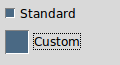
ttk中的指标元素支持background, borderwidth, indicatorcolor, indicatorrelief, indicatordiameter 和 indicatormargin。这些都是使用小部件样式的 style.configure() 设置为主题配置值。您可以通过更改 indicatordiameter 来更改 Tk 绘制主题的指示器元素的大小。例如:
style = ttk.Style()
style.layout('Custom.Checkbutton', style.layout('TCheckbutton'))
style.map('Custom.Checkbutton', **style.map('TCheckbutton'))
style.configure('Custom.Checkbutton', **style.configure('TCheckbutton'))
style.configure('Custom.Checkbutton', indicatordiameter='24')
将标准复选按钮样式 (TCheckbutton) 复制到新样式中,然后覆盖自定义样式的指示器大小。
请注意,对于使用不是由 Tk 绘制的指示器元素的主题,将不支持。例如,Windows 主题的指示器元素由 Visual Styles API 提供,其大小由系统定义的主题引擎决定。如果您必须启用这种主题自定义,则可以将指示器元素从“默认”主题导入到 Windows 主题中,但代价是随着 UI 外观和感觉开始变得奇怪,您的应用程序的某些部分在该平台上看起来很奇怪不匹配。
关于python - Ttk 主题设置,我们在Stack Overflow上找到一个类似的问题: https://stackoverflow.com/questions/32977148/