我有这个 UI 要求 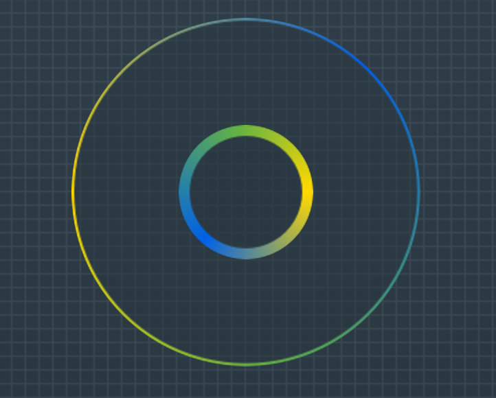
目前,我有一个 div 的工作解决方案(具有固定的高度和宽度以及外部渐变边框的背景图像)和一个伪元素,定位 absolute 带有背景图像内部边界。
.div {
    position: relative;
    width: 254px;
    height: 254px;
    border: 2px solid transparent;
    border-radius: 50%;
    background: url(../img/gradient_border_circle.png) no-repeat 50%;
}
div:before {
    content: "";
    position: absolute;
    top: 50%;
    transform: translate(-50%,-50%);
    left: 50%;
    width: 98px;
    height: 98px;
    border-radius: 50%;
    background: url(../img/gradient_border_circle_inner.png) no-repeat 50%;
}
但是,我正在寻找一种更优雅的解决方案(纯 css 或 svg 渐变?)而不使用背景图像,其中渐变可以在没有像素化的情况下缩放。
我已经研究过,我遇到的最接近的是 https://codepen.io/nordstromdesign/pen/QNrBRM和 Possible to use border-radius together with a border-image which has a gradient?但是我需要一个中心透明的解决方案,以便通过页面的背景显示
更新:理想情况下,我正在寻找一种在所有现代浏览器中都具有相对良好支持的解决方案。
最佳答案
SVG 是创建圆形并在其周围绘制渐变轮廓/边框的推荐方法。
SVG 有一个 circle 元素,可用于绘制圆形。这个形状可以用纯色、渐变或图案填充和勾勒轮廓。
* {box-sizing: border-box;}

body {
  background: linear-gradient(#333, #999);
  text-align: center;
  min-height: 100vh;
  padding-top: 10px;
  margin: 0;
}
svg {vertical-align: top;}
<svg width="210" height="210">
<defs>
<linearGradient id="grad1" x1="0" y1="1" x2="1" y2="0">
<stop offset="0" stop-color="#f5d700" />
<stop offset="1" stop-color="#0065da" />
</linearGradient>
<linearGradient id="grad2" xlink:href="#grad1" x1="1" y1="0" x2="0" y2="1"></linearGradient>
</defs>
<g fill="none">
<circle cx="100" cy="100" r="95" stroke="url(#grad1)" stroke-width="2" />
<circle cx="100" cy="100" r="40" stroke="url(#grad2)" stroke-width="5" />
</g>
</svg>关于css - 纯CSS渐变圆形边框,我们在Stack Overflow上找到一个类似的问题: https://stackoverflow.com/questions/46029719/